Kieler Woche 2020
Kieler Woche 2020
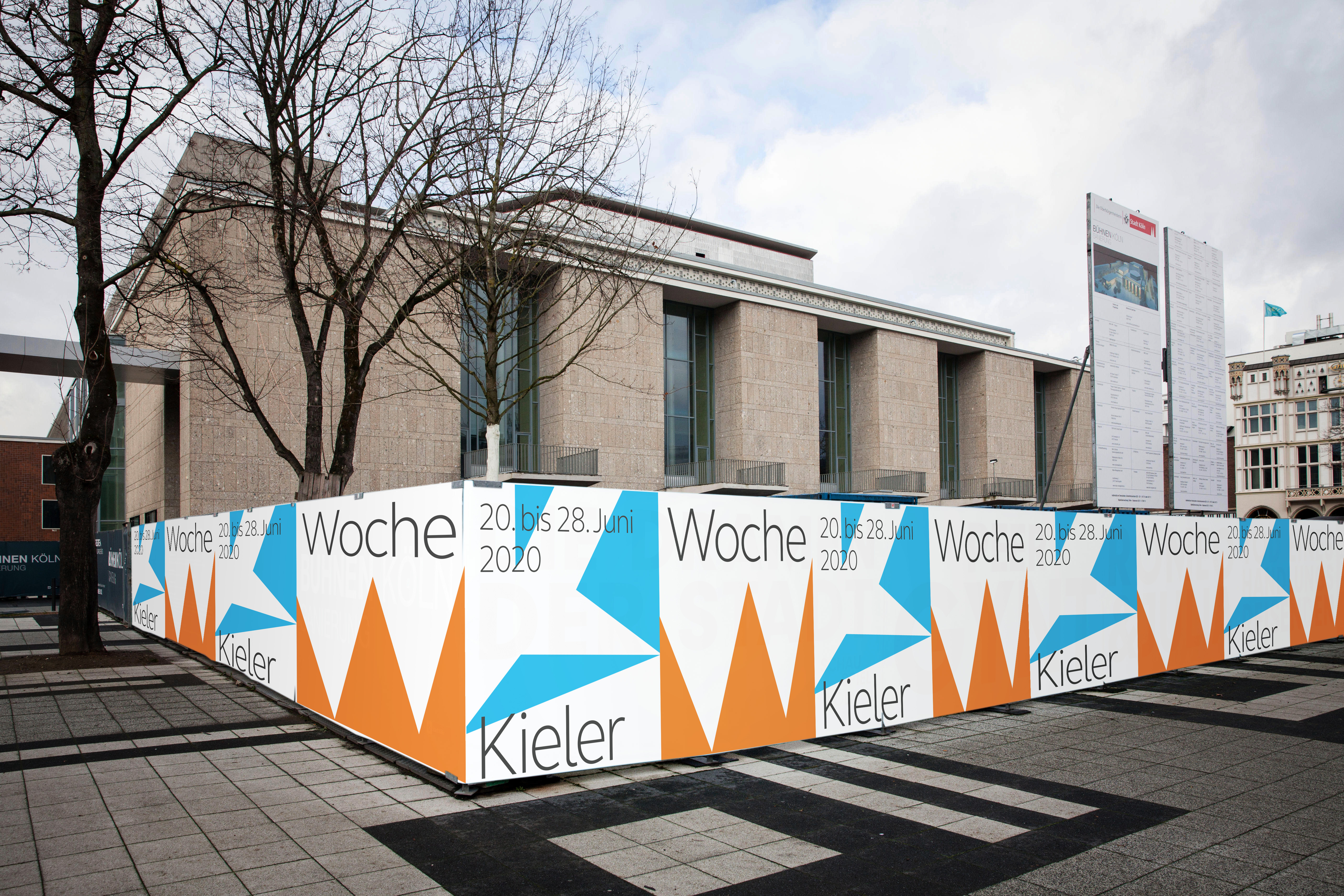
We were invited to take part in the well-known design competition for Kieler Woche 2020. We have developed various designs for this.
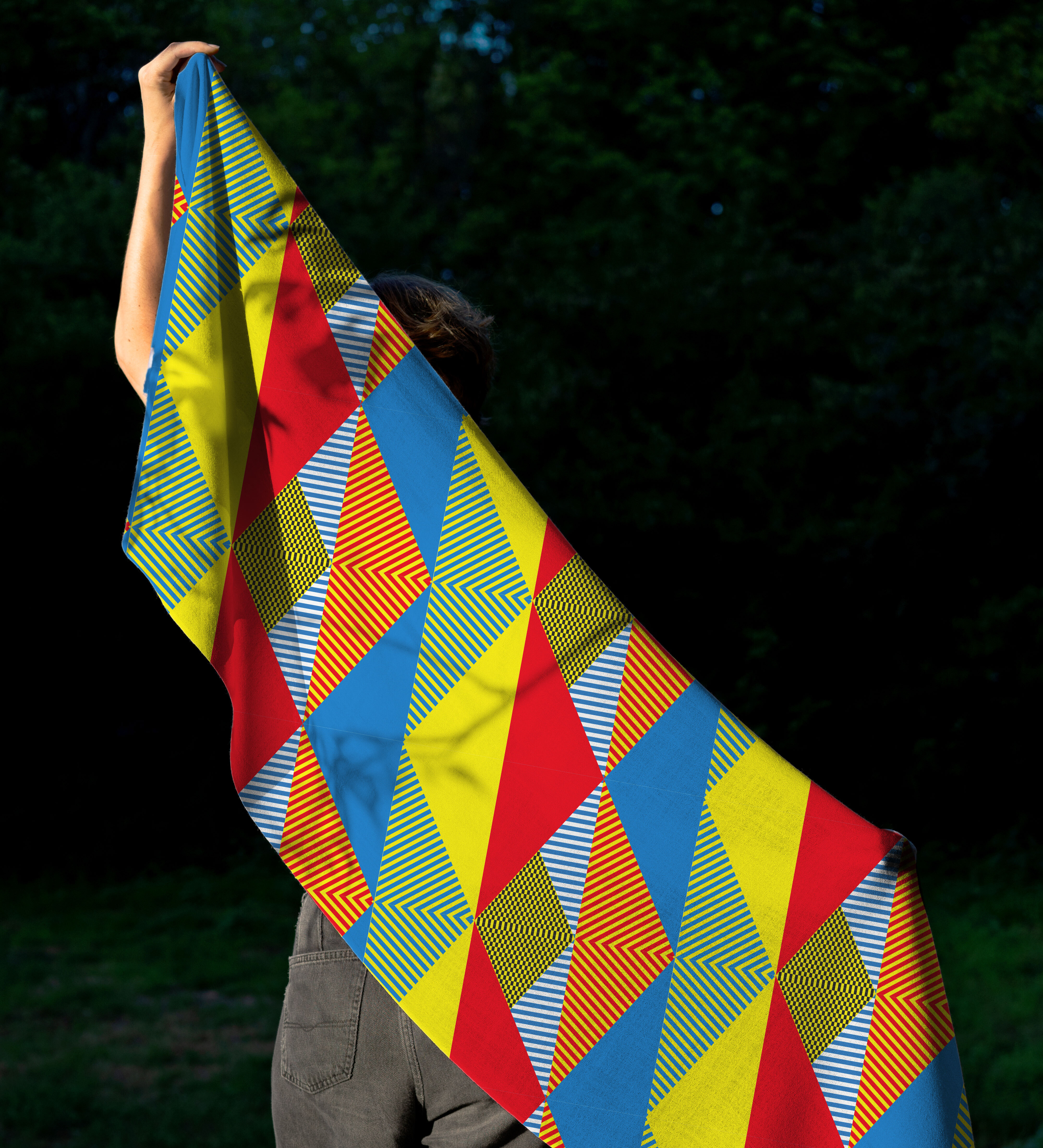
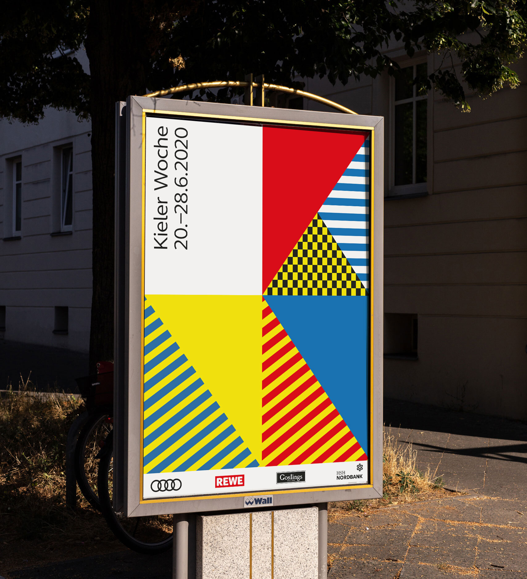
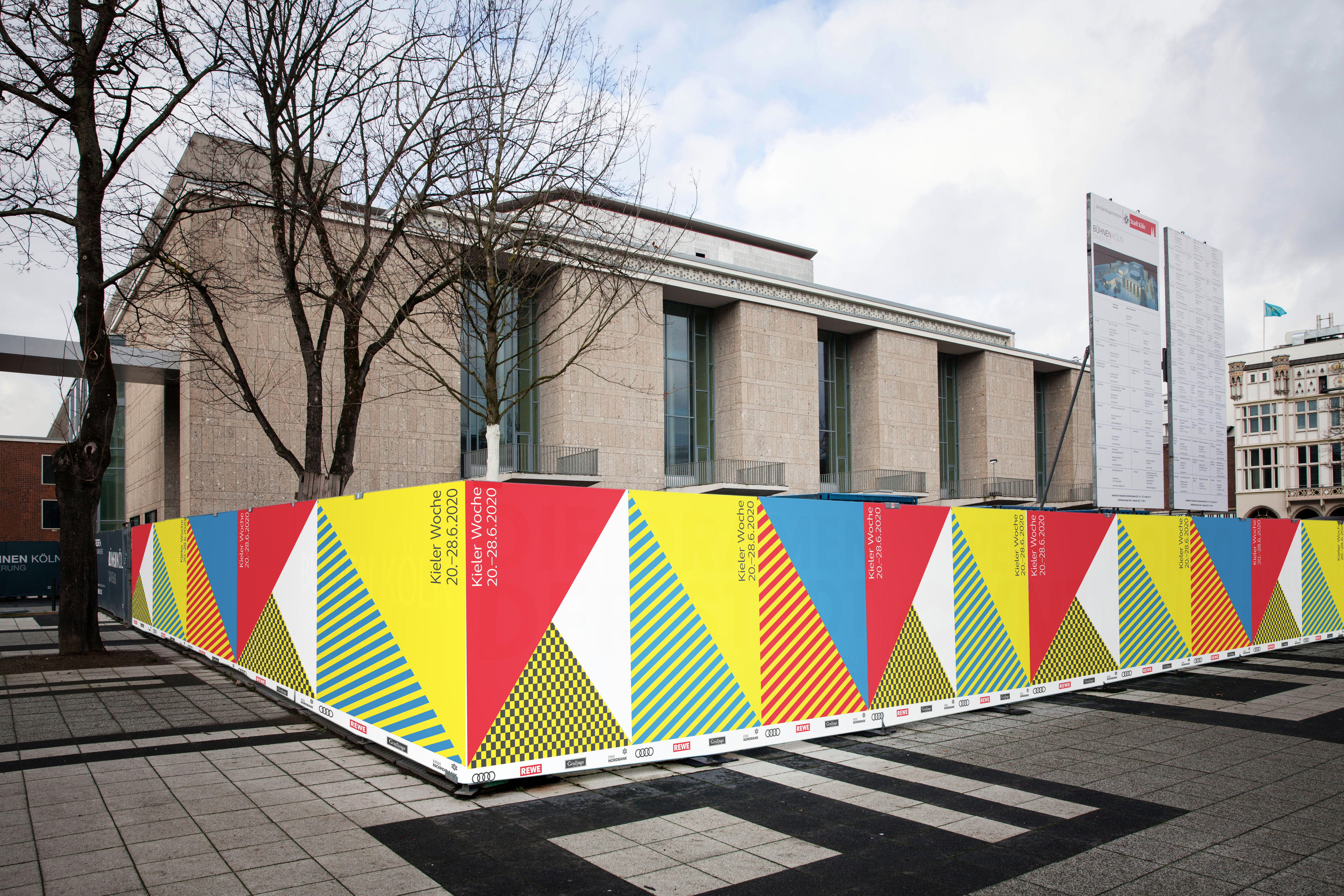
Deconstruction
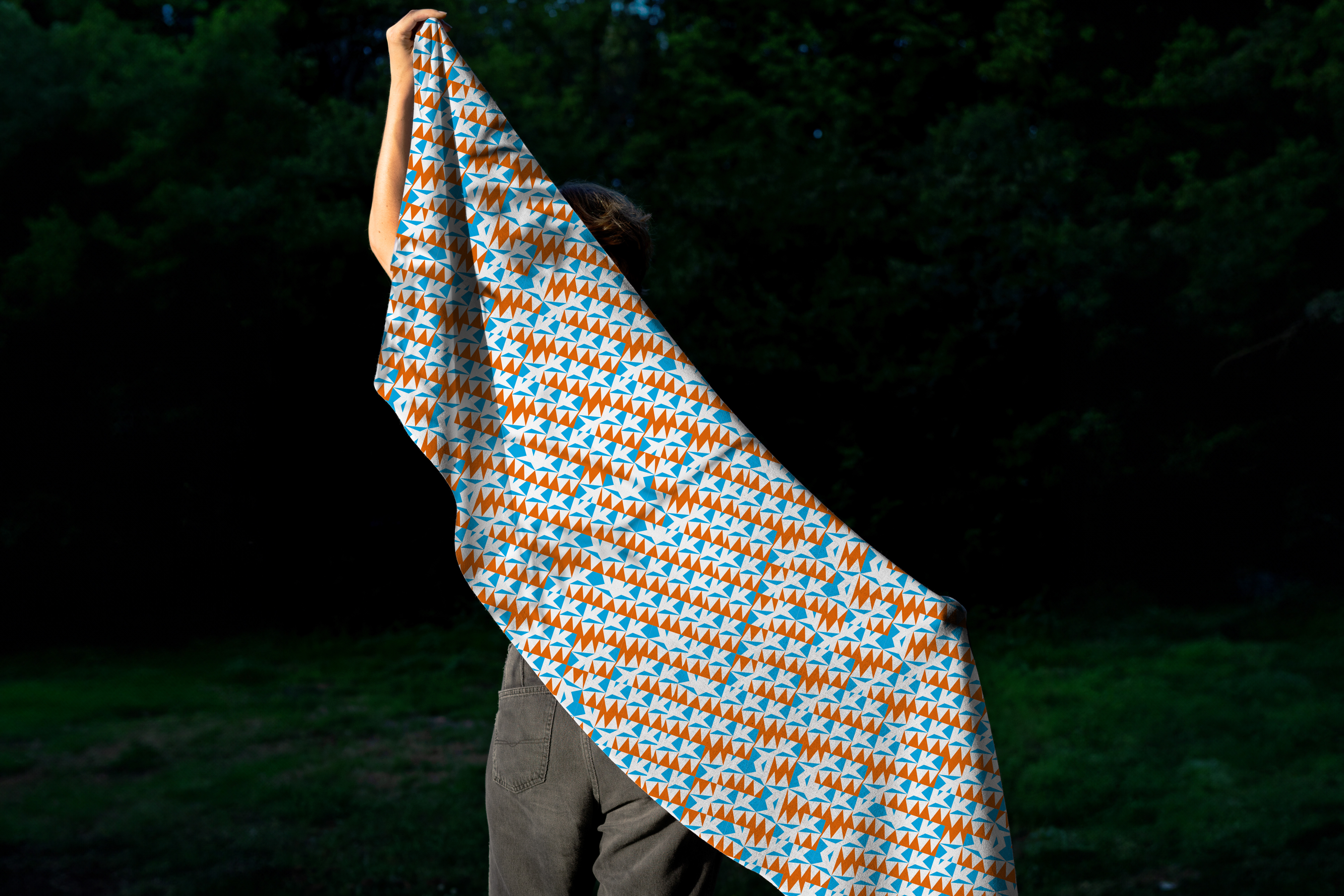
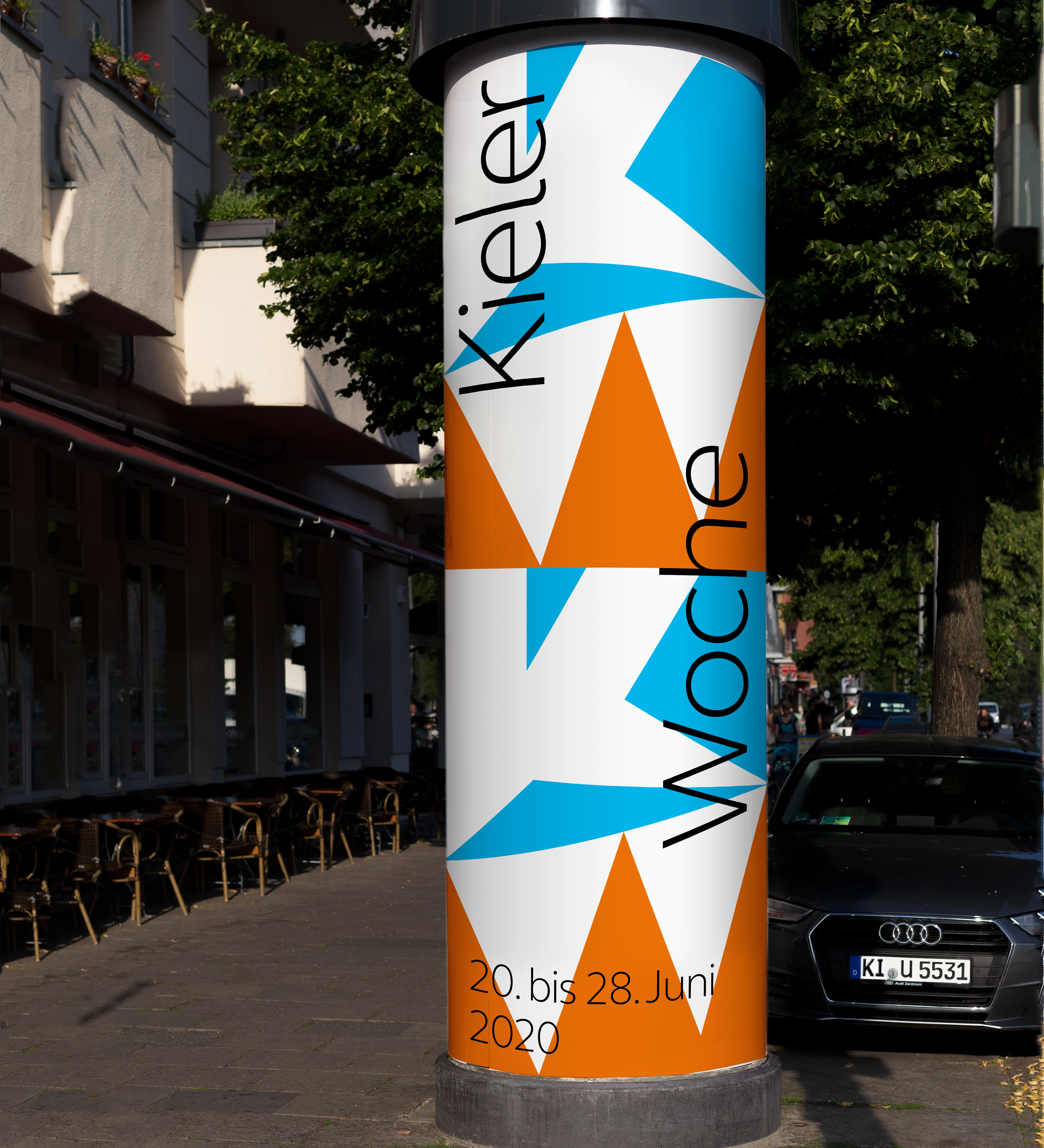
The design deconstructs the initial letters of Kieler Woche (KW) into geometric shapes. The patterns and colors are reminiscent of the flag alphabet. They can be read as “KW”, but at the same time are reminiscent of the sails, sky and spectators present at Kieler Woche.
Depending on the application, the colors and patterns can be combined in different ways. The result is a playful and striking system that enables recognizable yet individually designed media thanks to its clear design language.

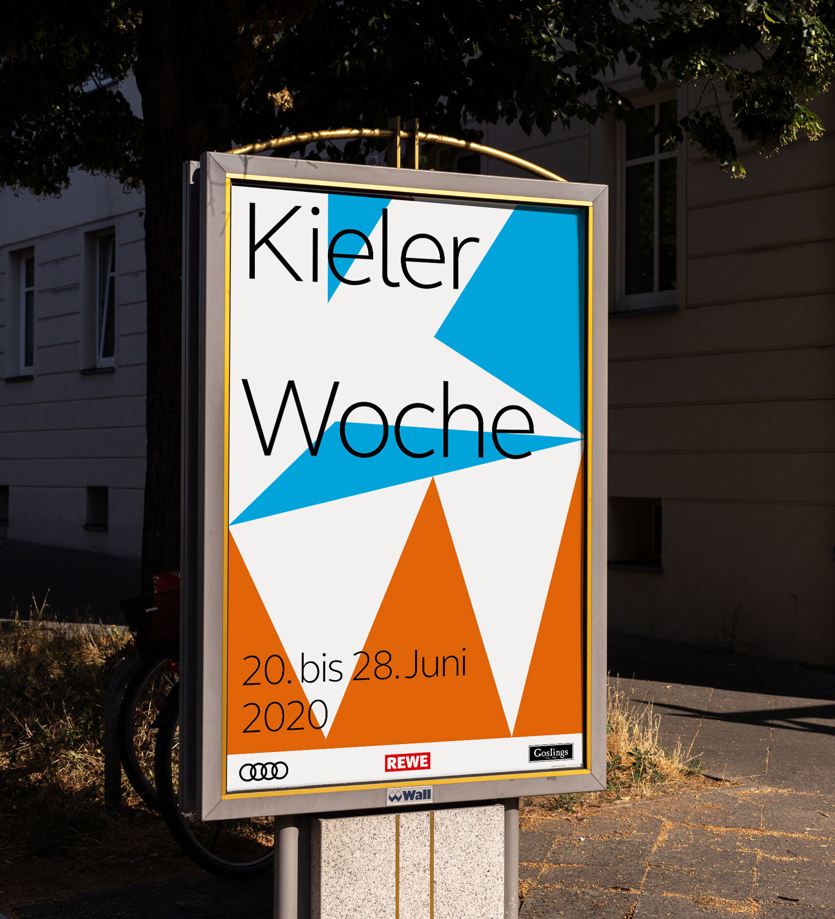
Sails
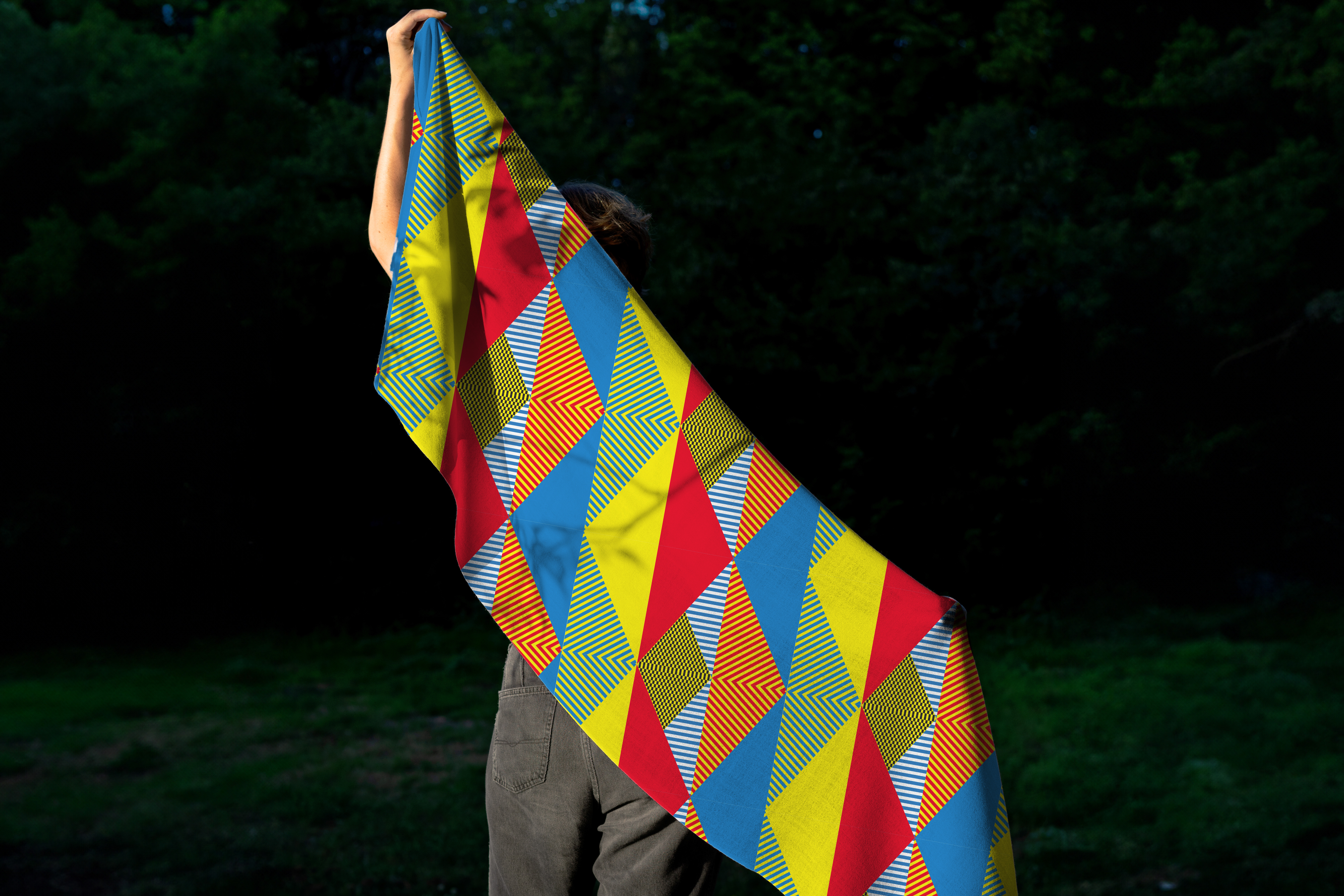
The second design we developed works with white and red sails that can be seen at the Kieler Woche competitions. The reddish-orange hue is not only found in the sails of historic boats, but also in the wooden paneling.
The abstraction of the sails and their variable arrangement create a compact, striking image that, in addition to being highly recognizable, can also respond to different media formats.