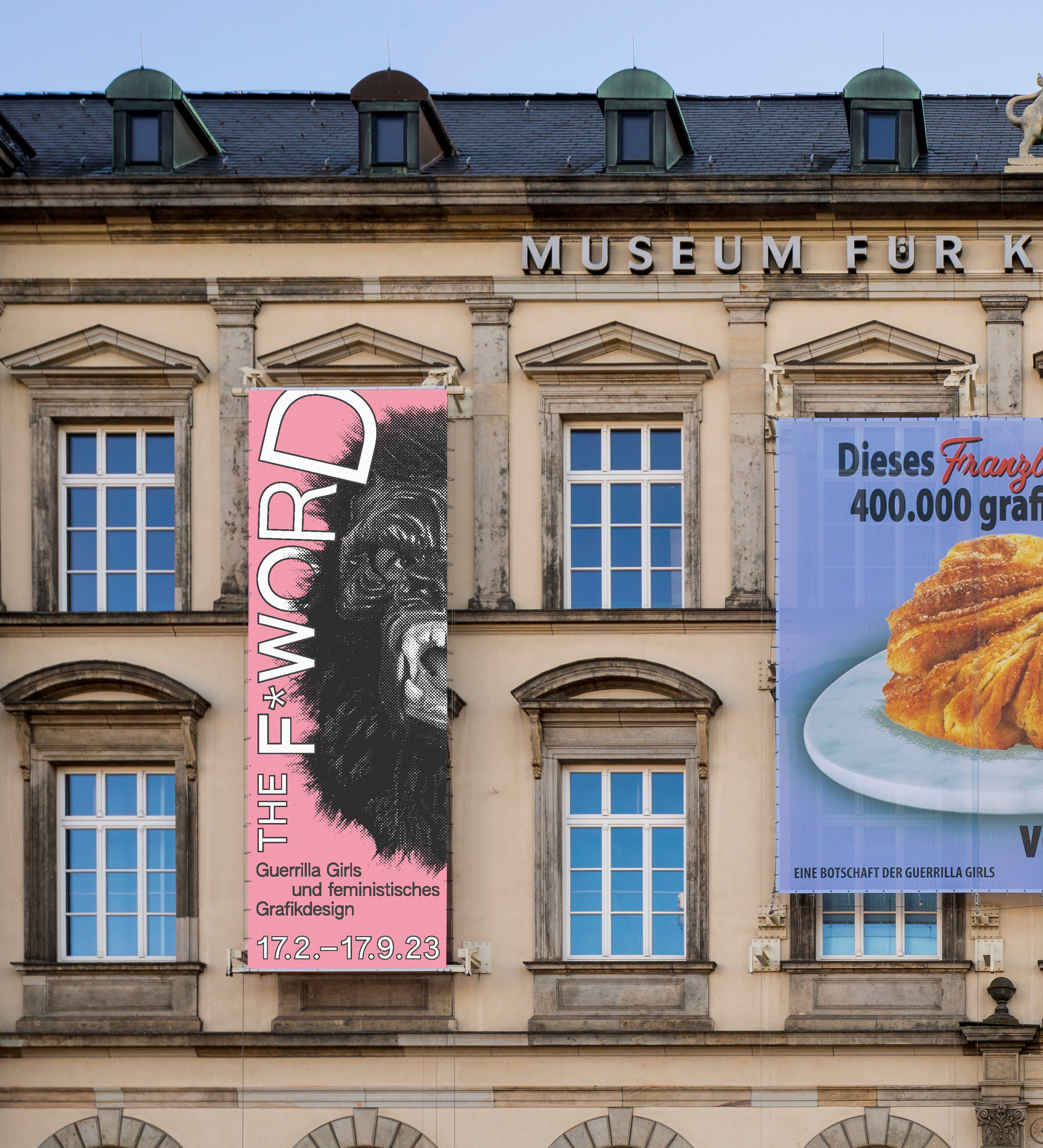
The F*Word
The F*Word – Guerrilla Girls and feminist graphic design
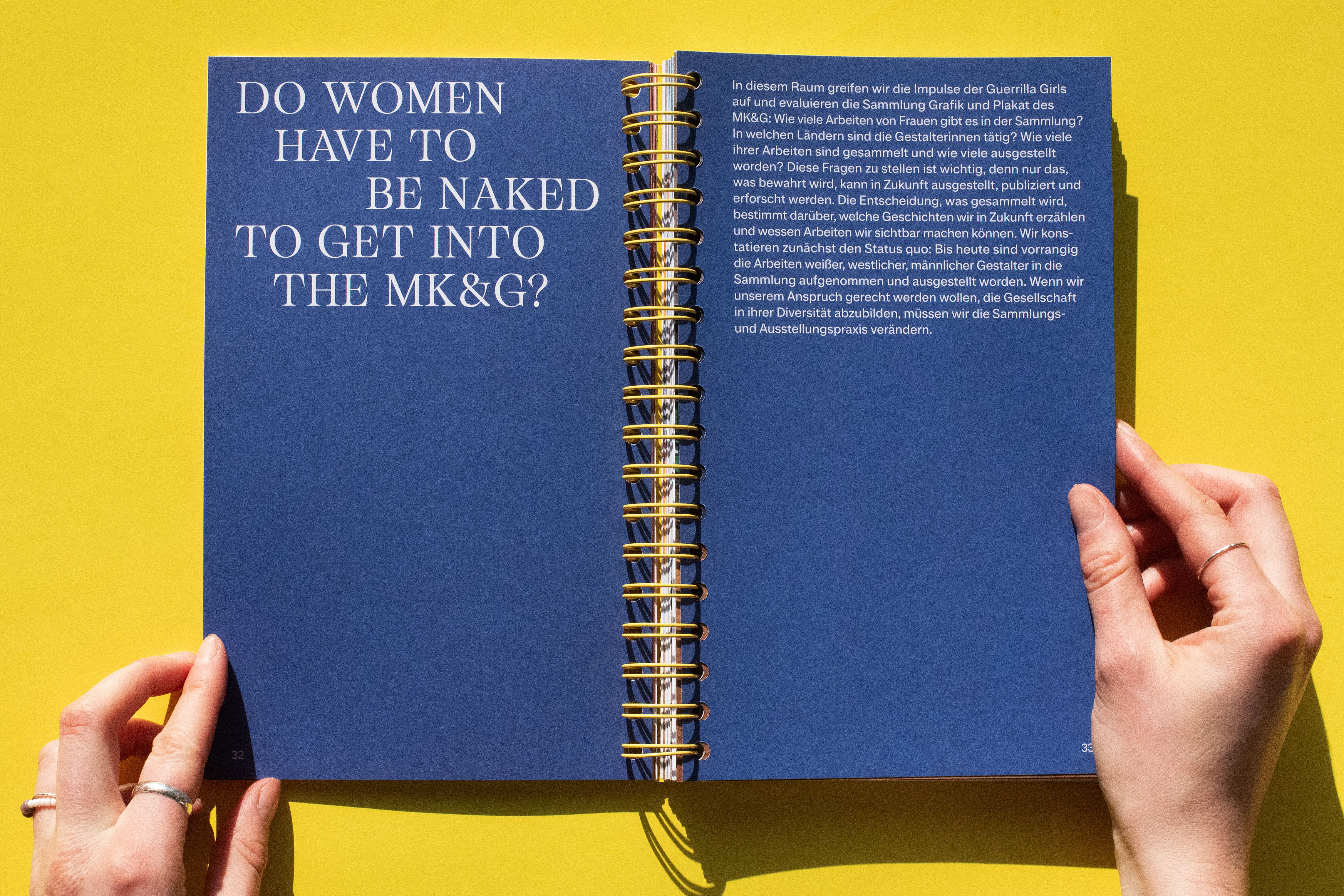
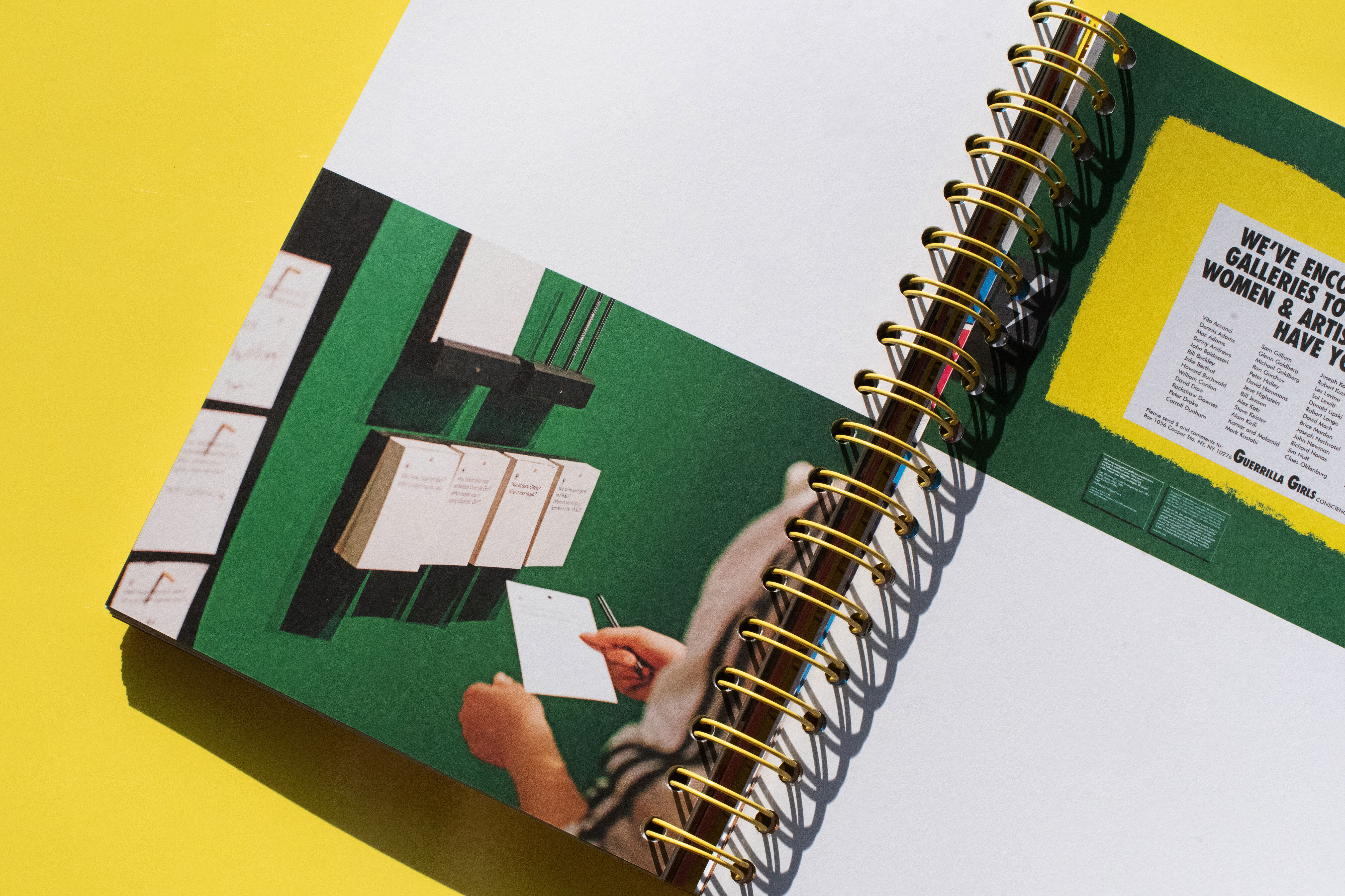
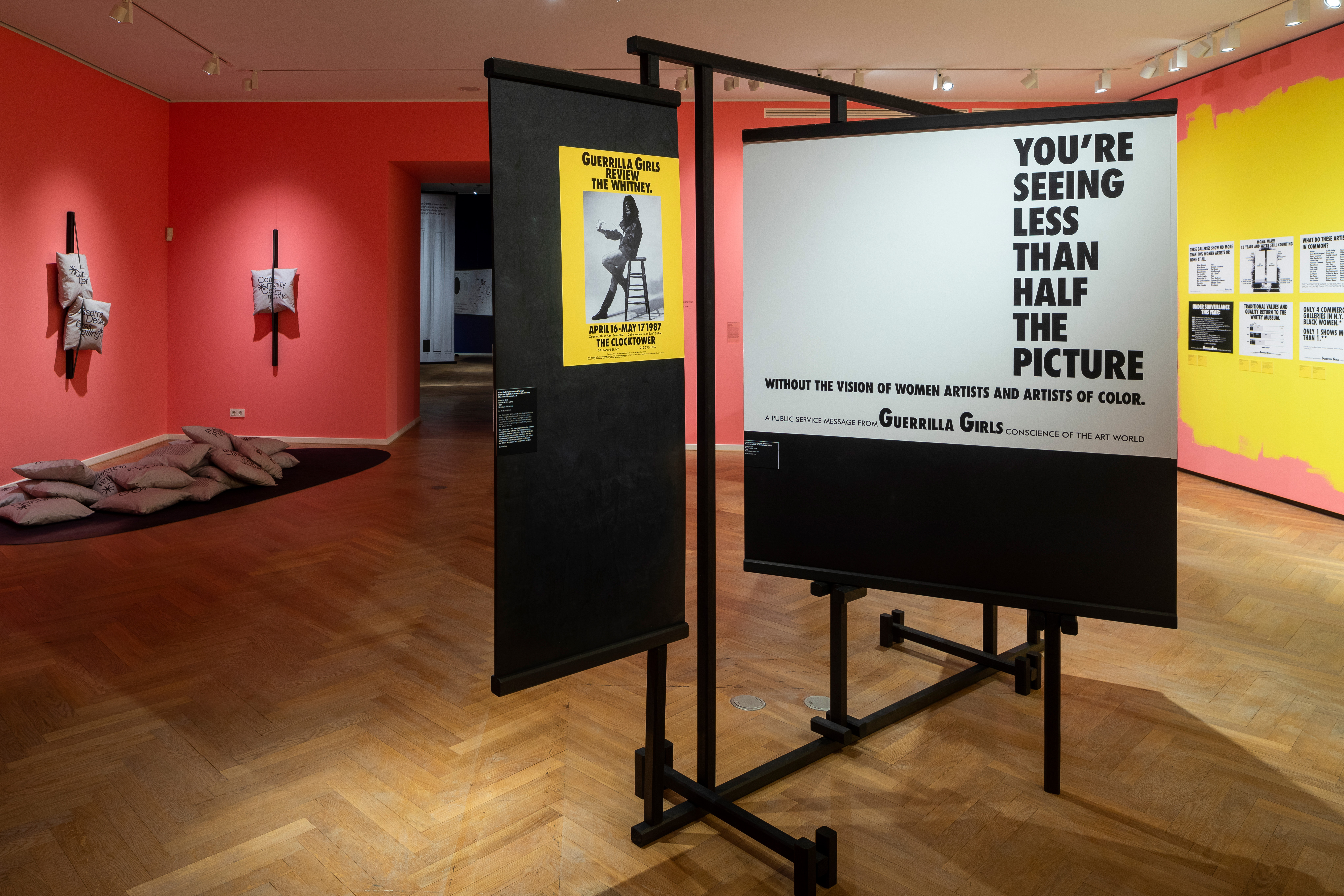
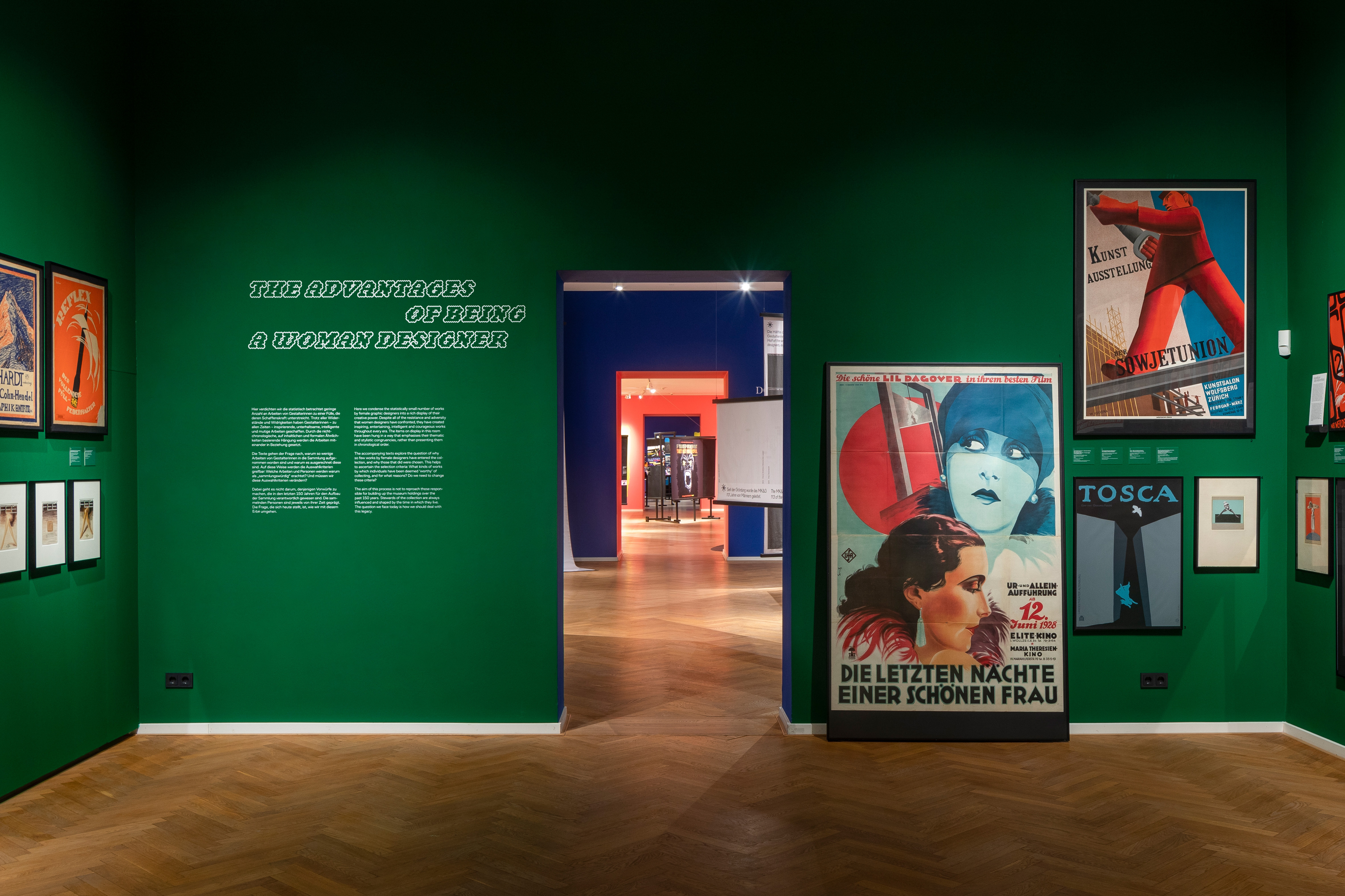
The posters of the artist group Guerrilla Girls form the starting point for the critical examination of the MK&G’s Grafik & Plakat collection: 400 works by female designers from 1870 to the present shown in the exhibition are located in the context of the collection.
Exhibition graphics
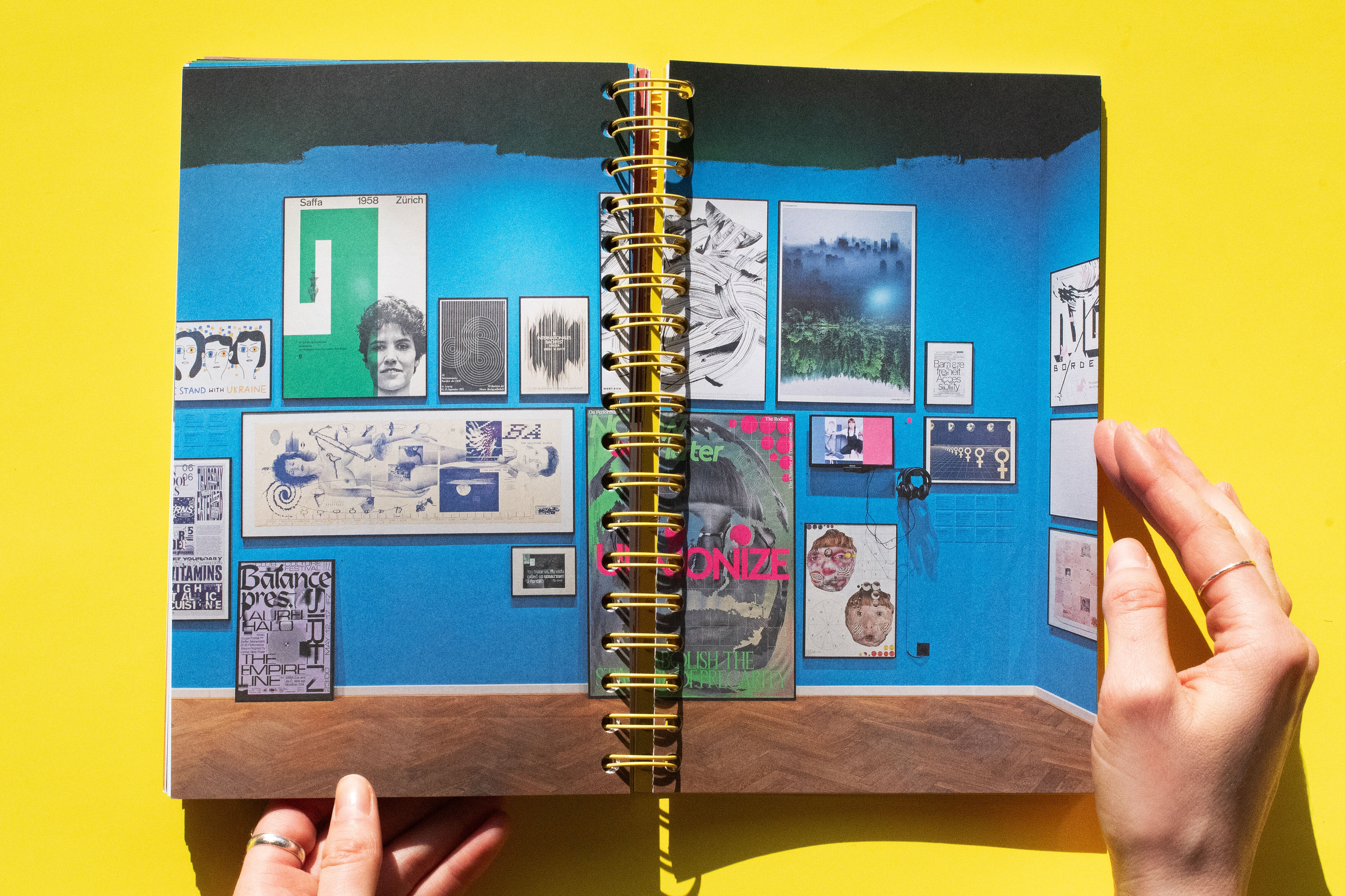
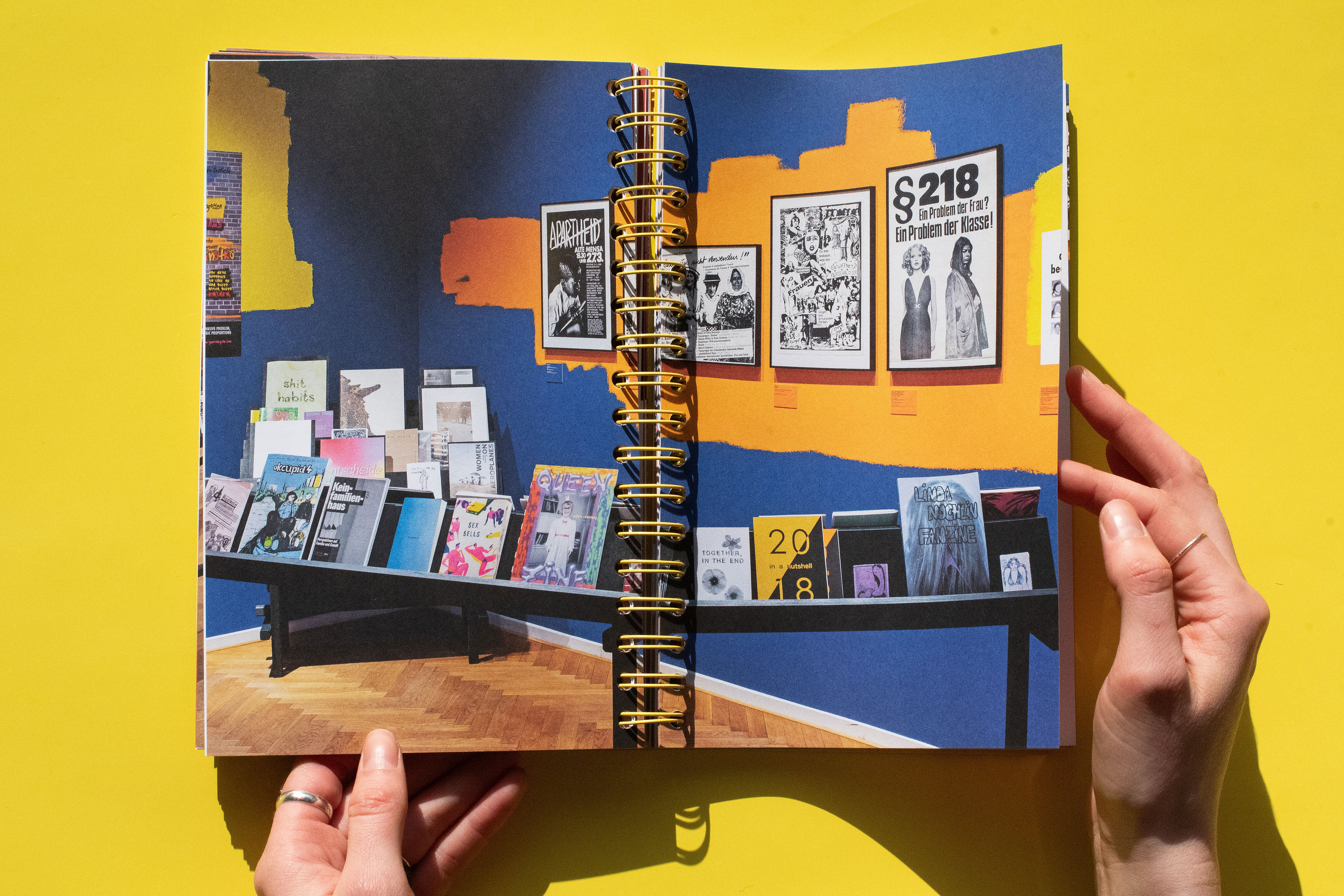
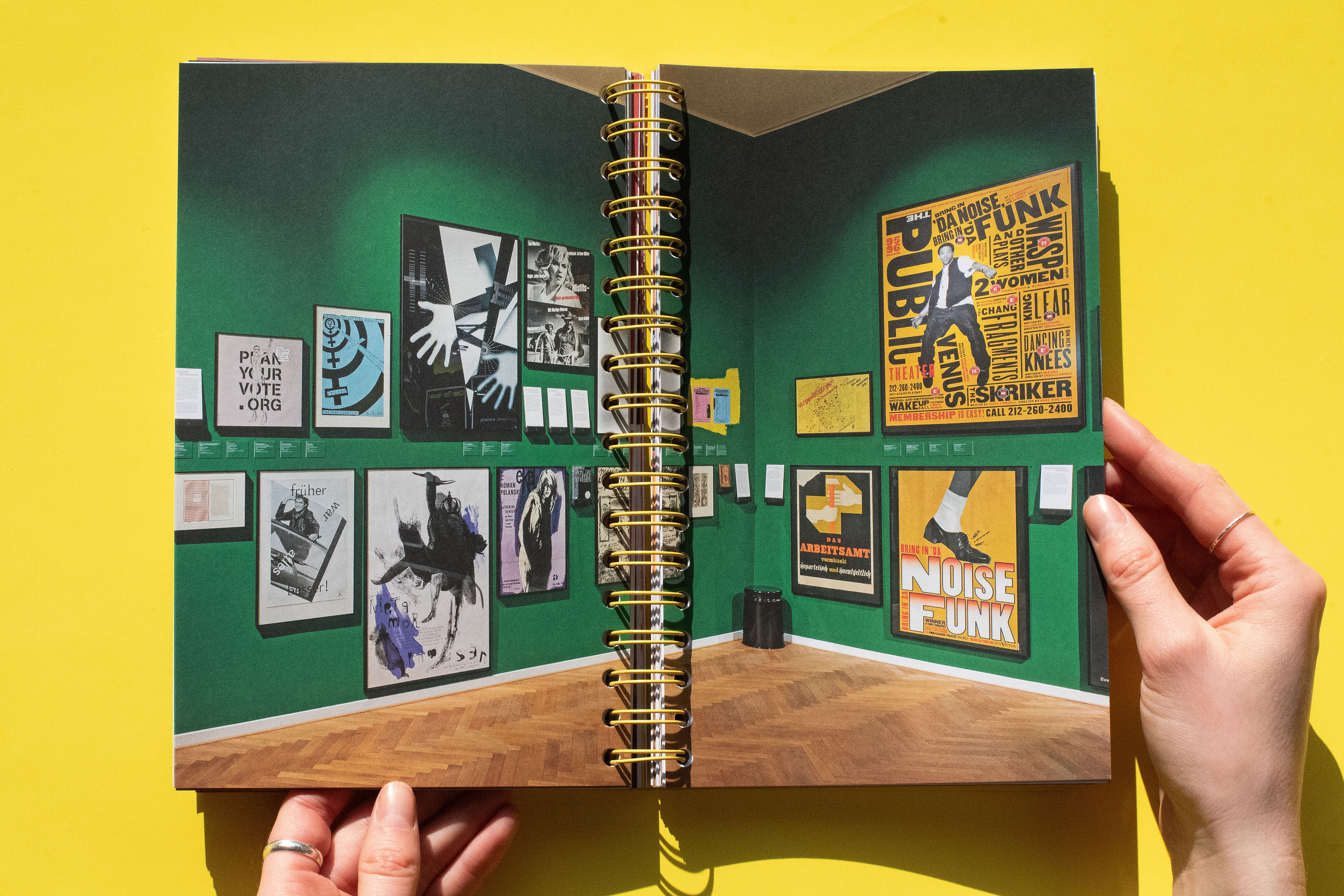
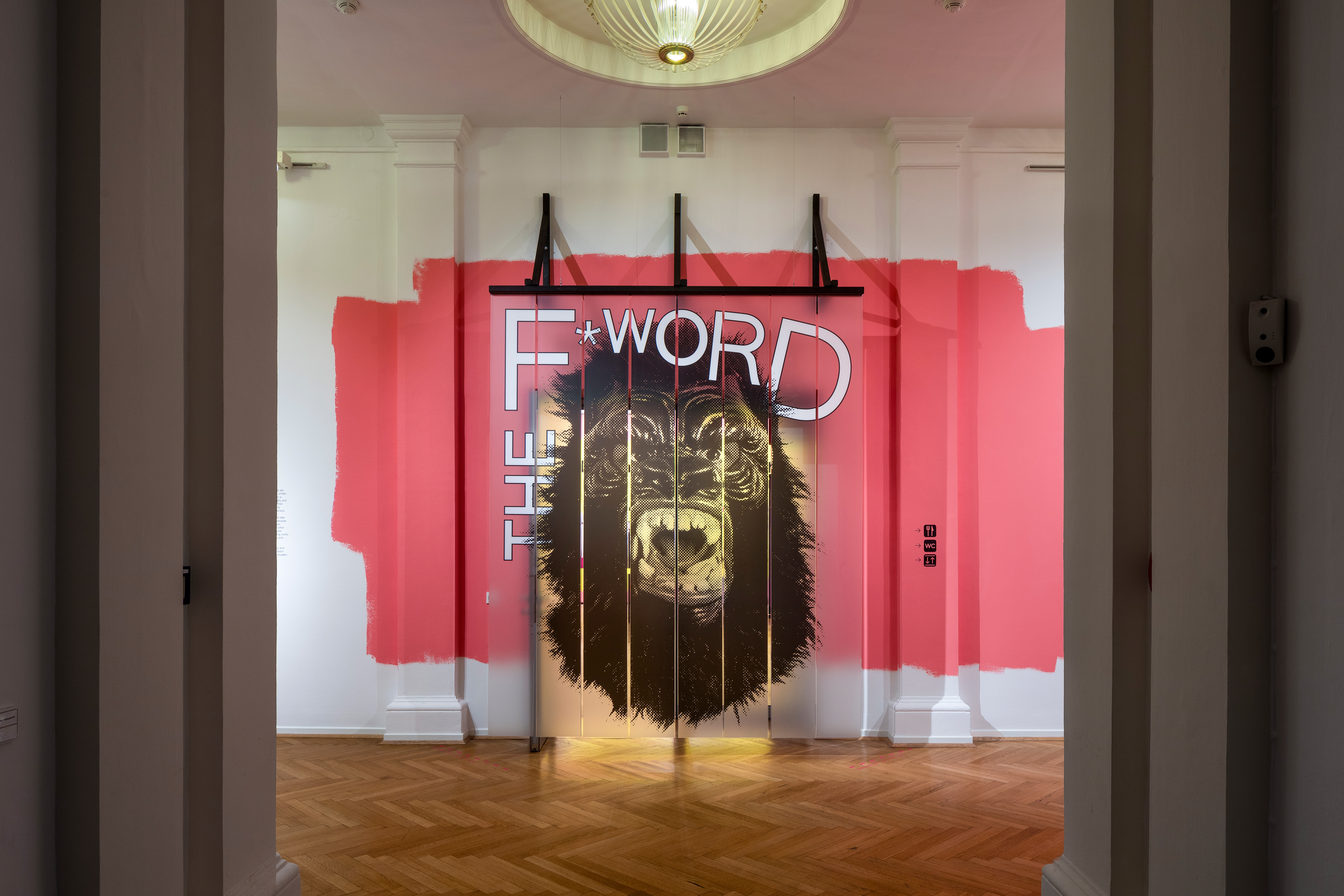
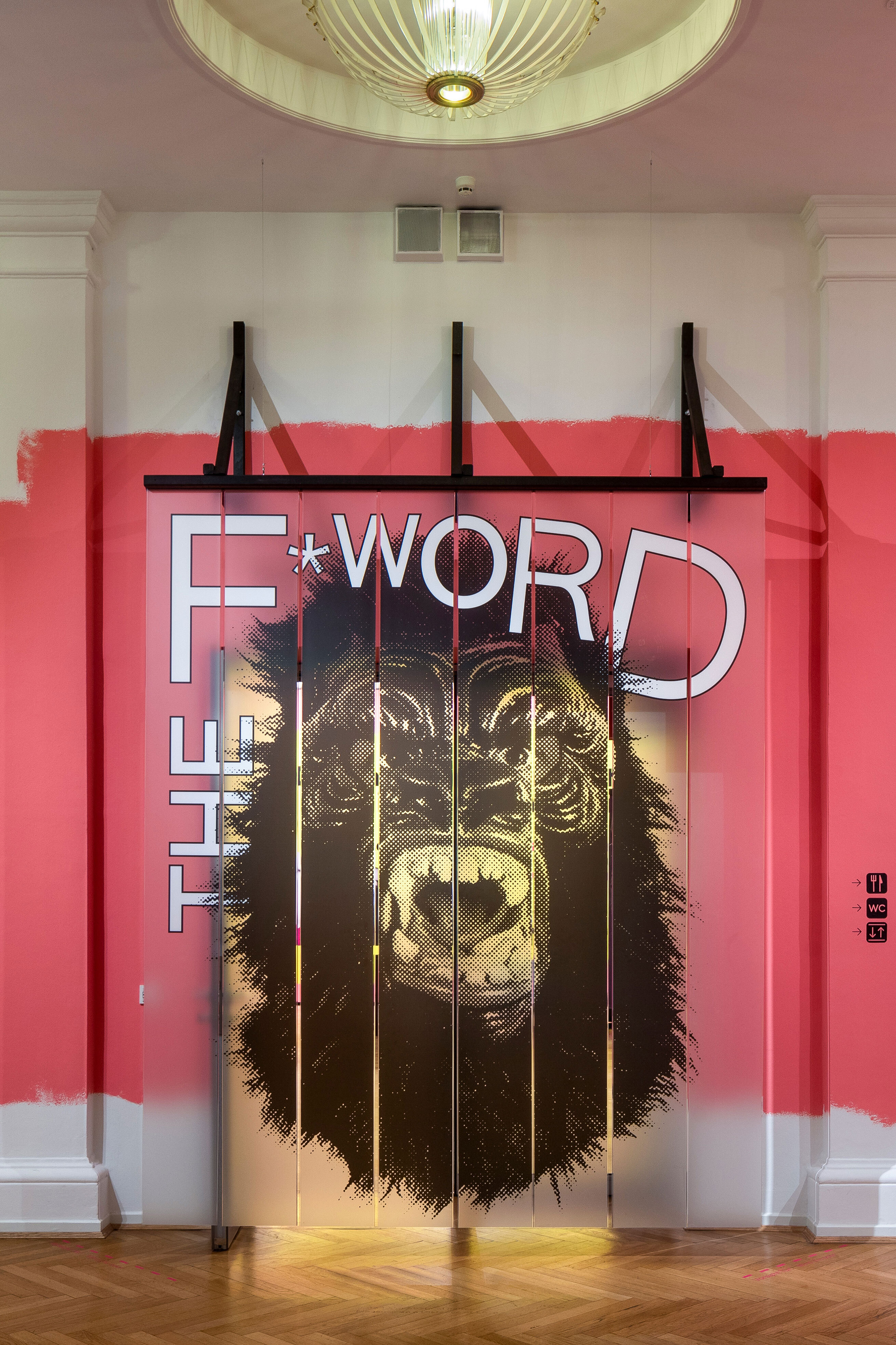
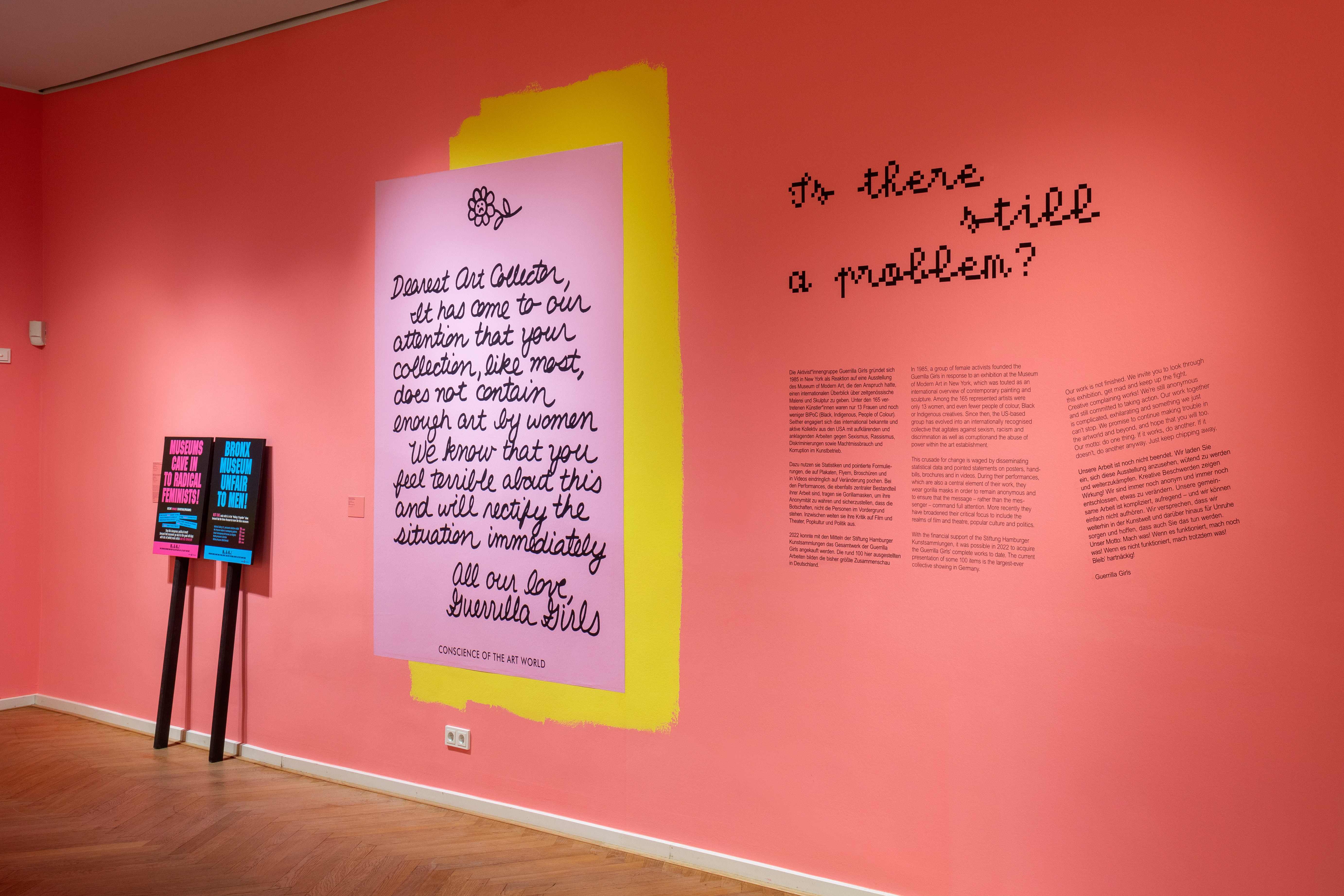
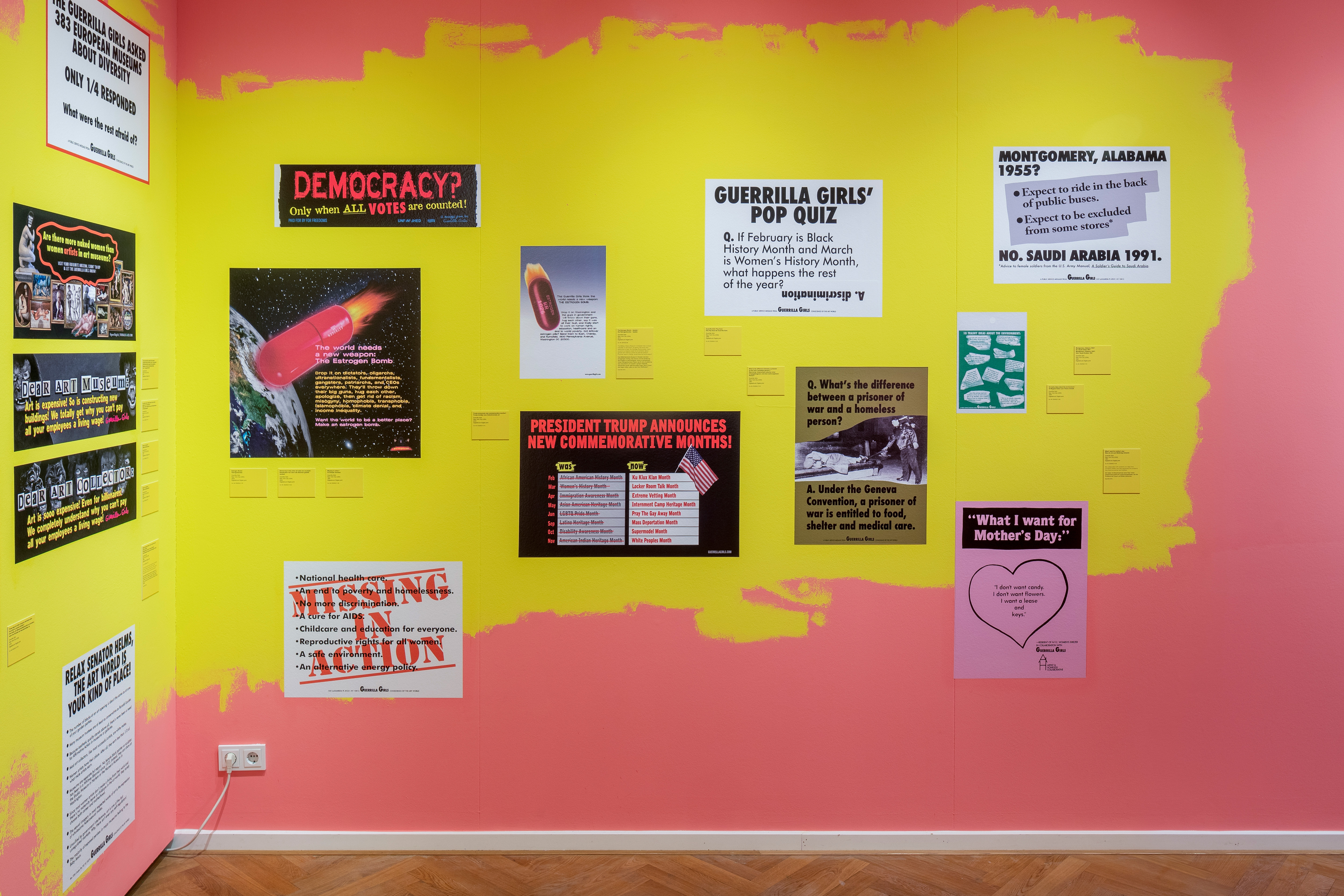
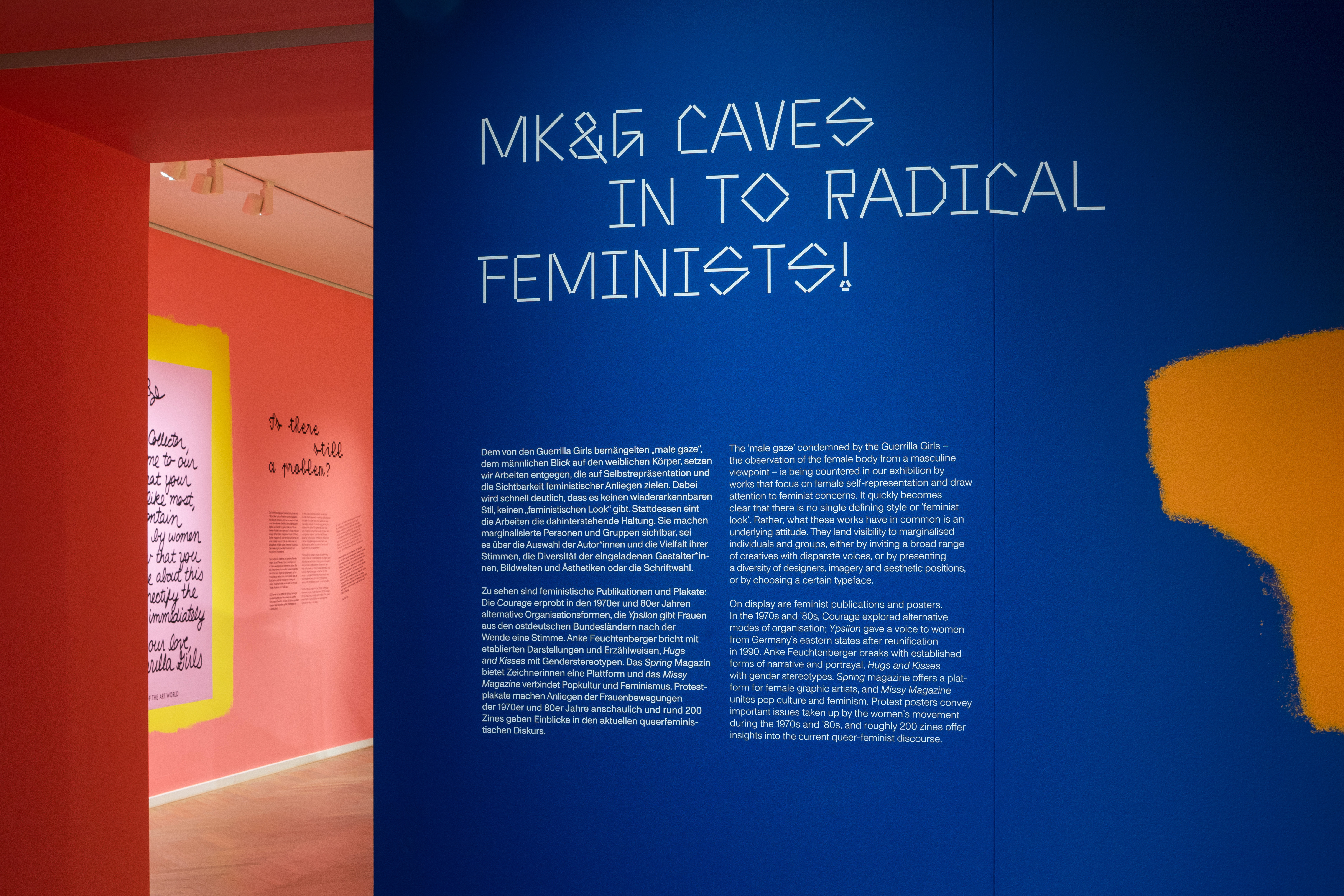
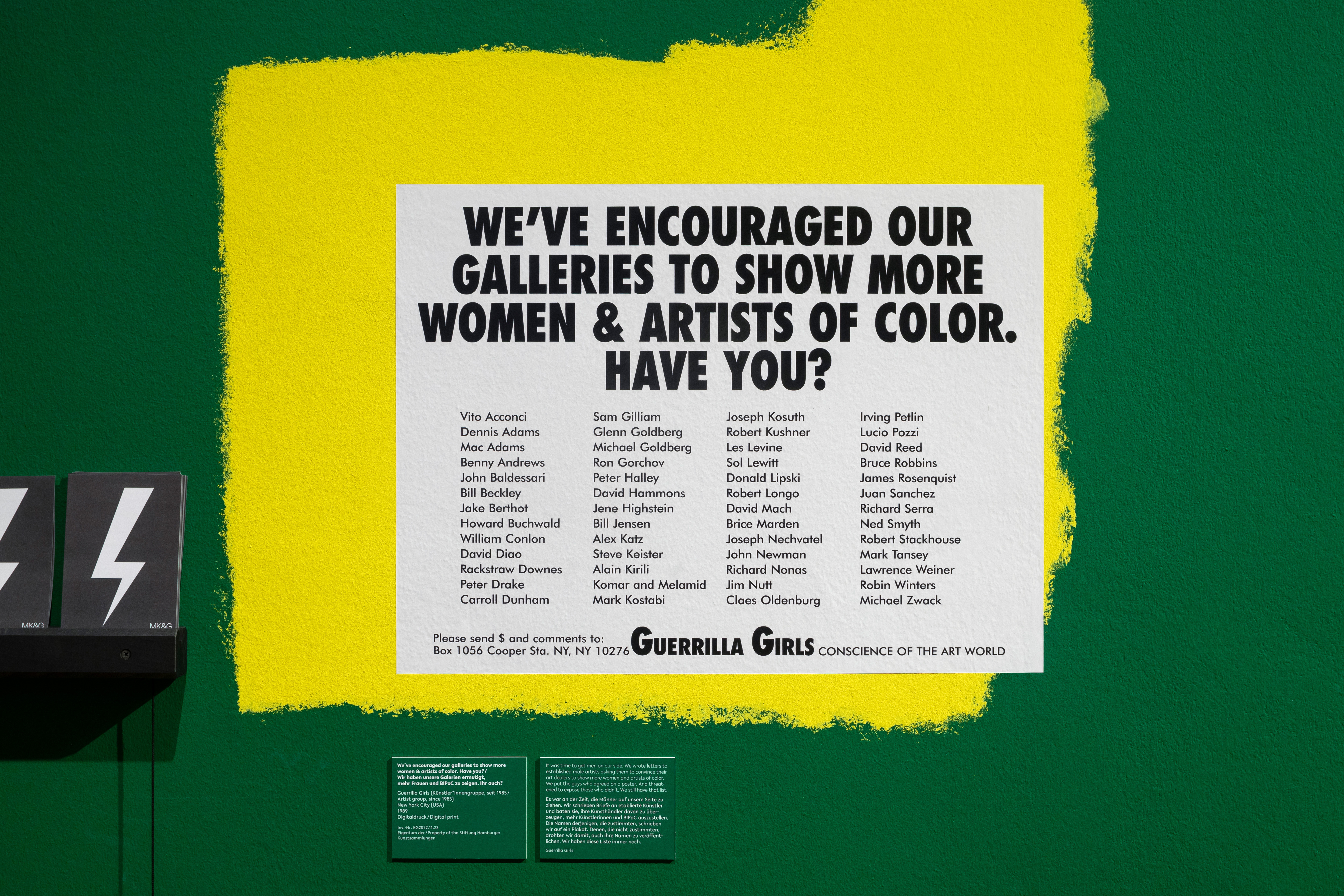
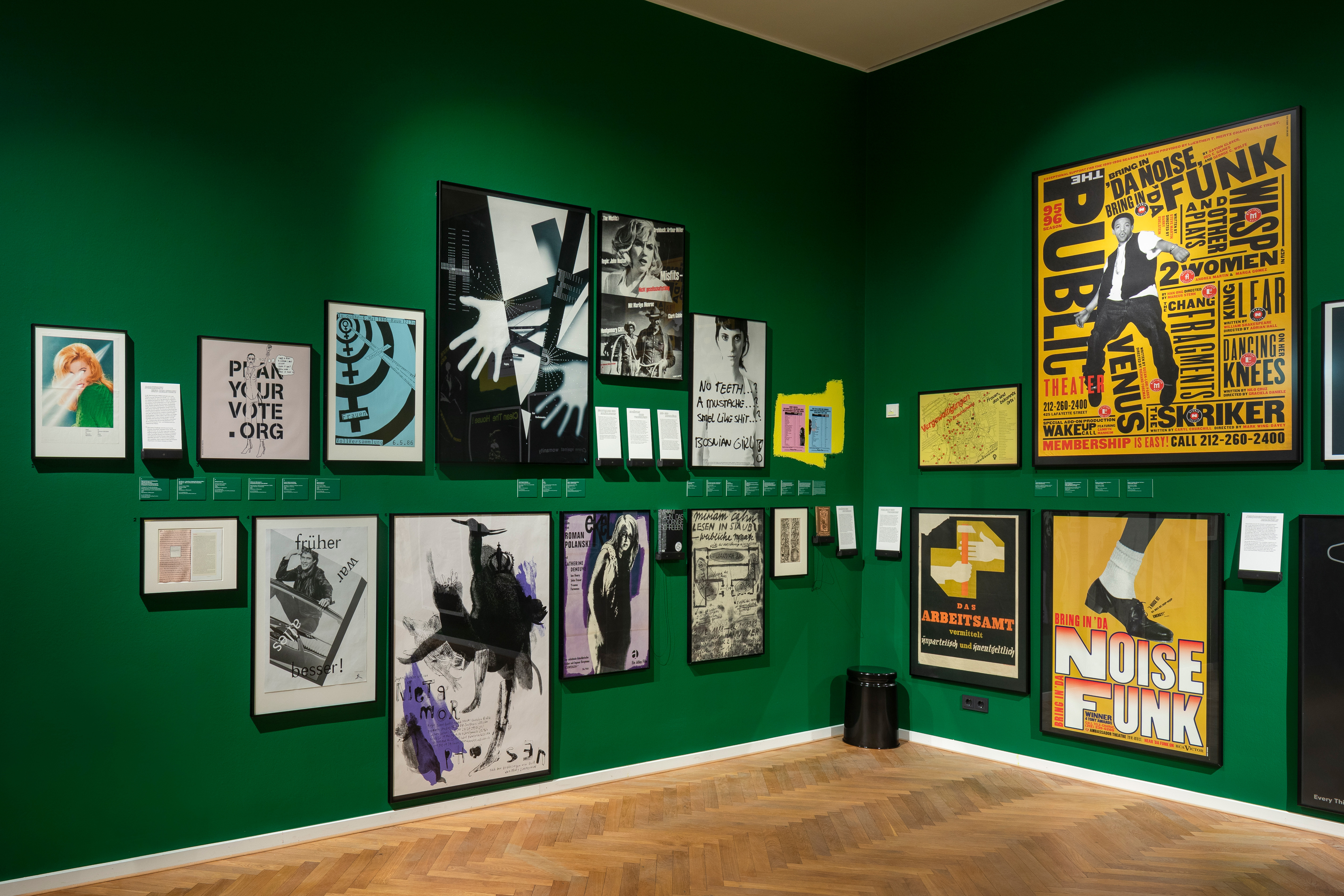
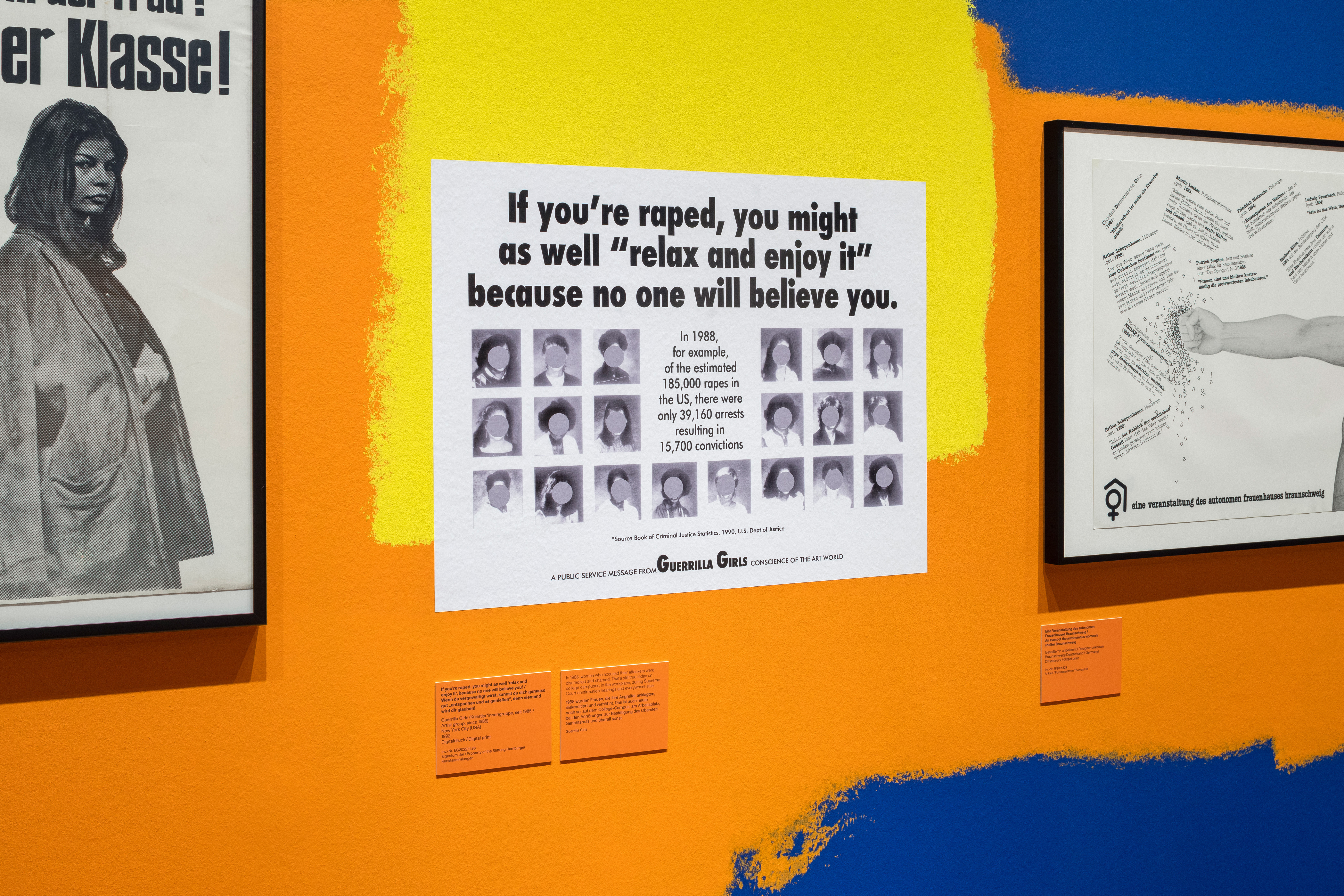
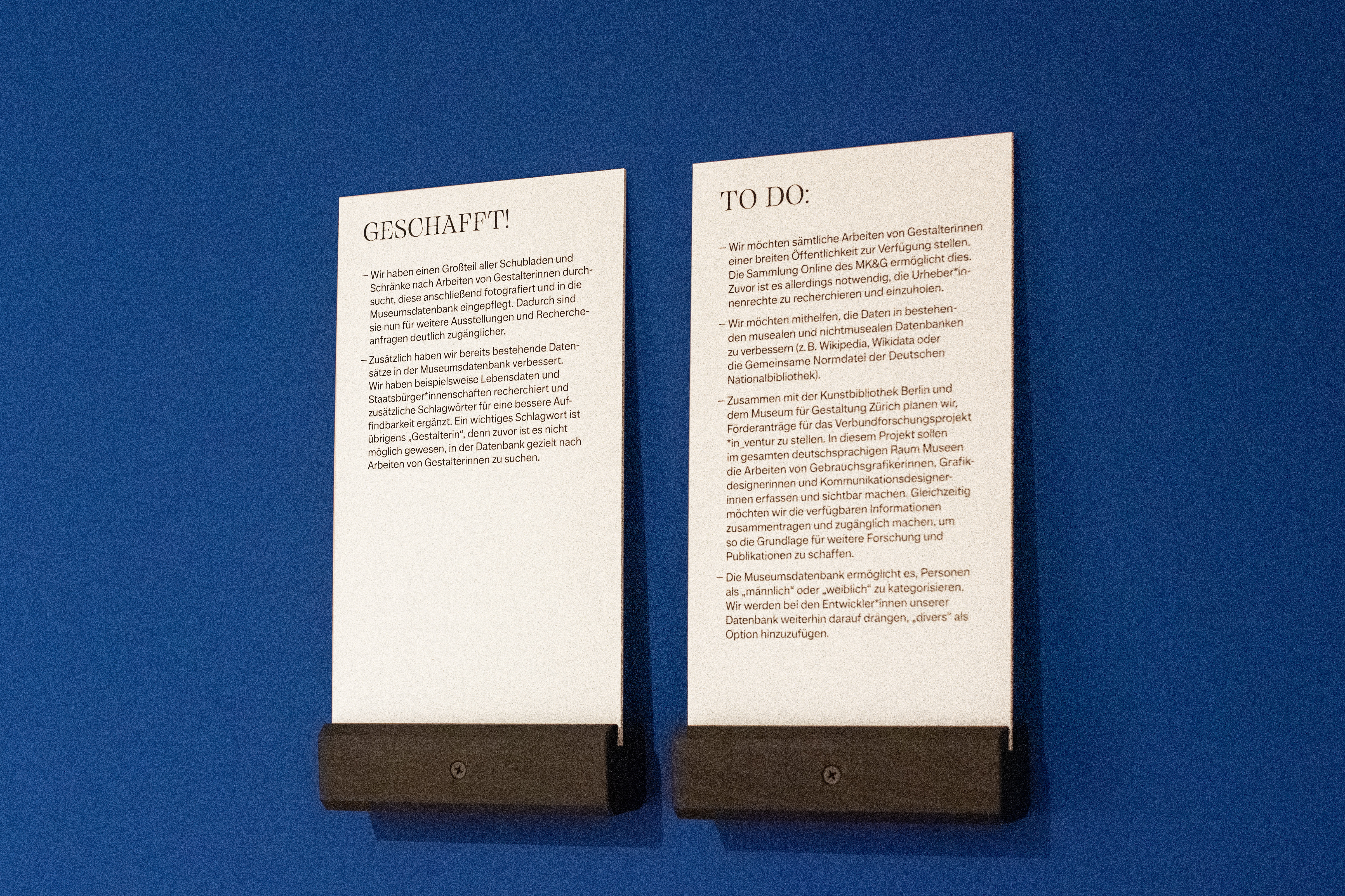
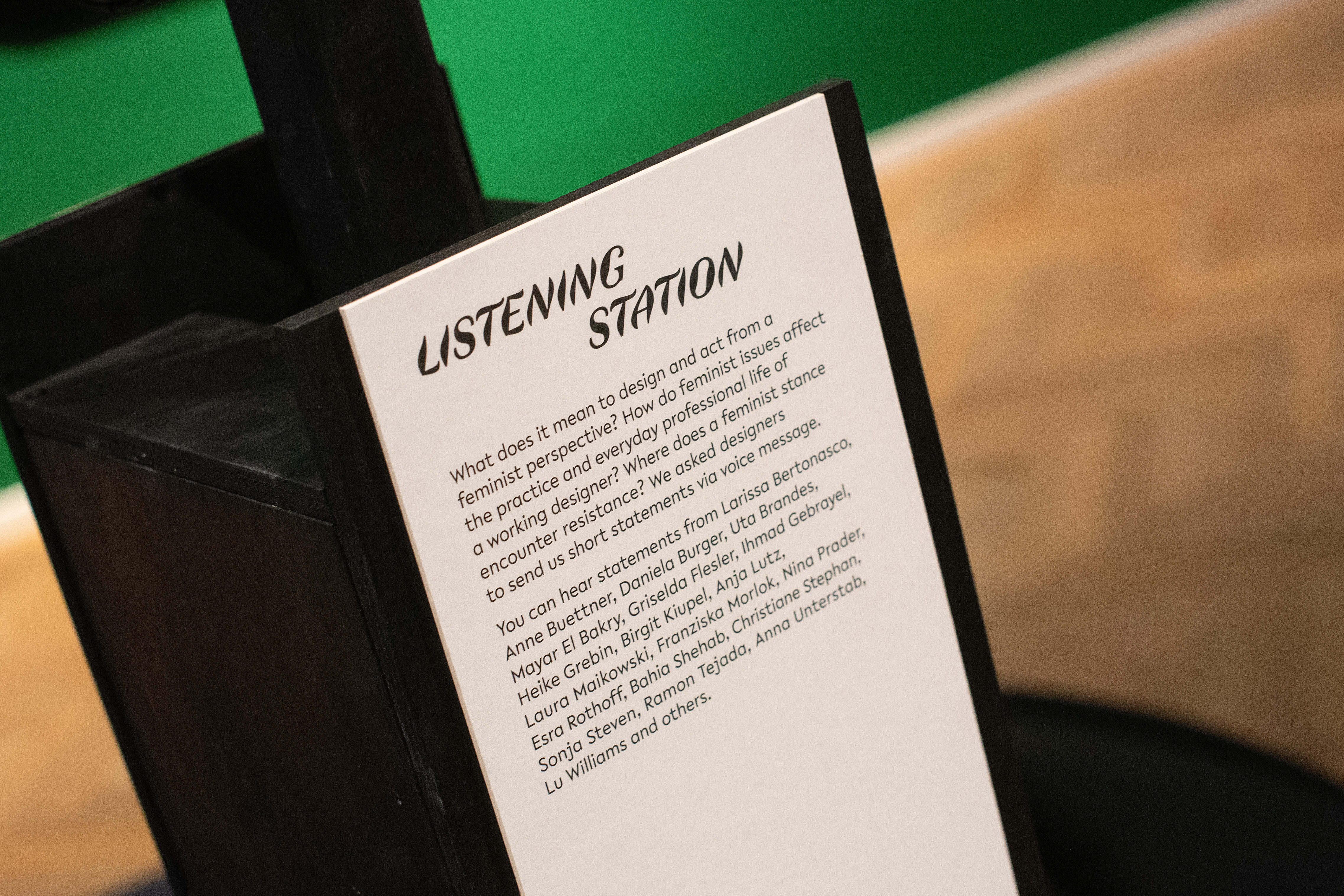
The exhibition does not provide an overview, but rather insights into a process: the provocative works of the activist group “Guerrilla Girls”, who have been exposing sexism and racism in the art world since 1985, are shown in the central room. The second room looks at the MK&G’s collection of graphic art and posters: Only 1.5 percent of the collected works are attributed to women. Distaff Studio makes the examination of the graphics collection accessible in mediation stations.
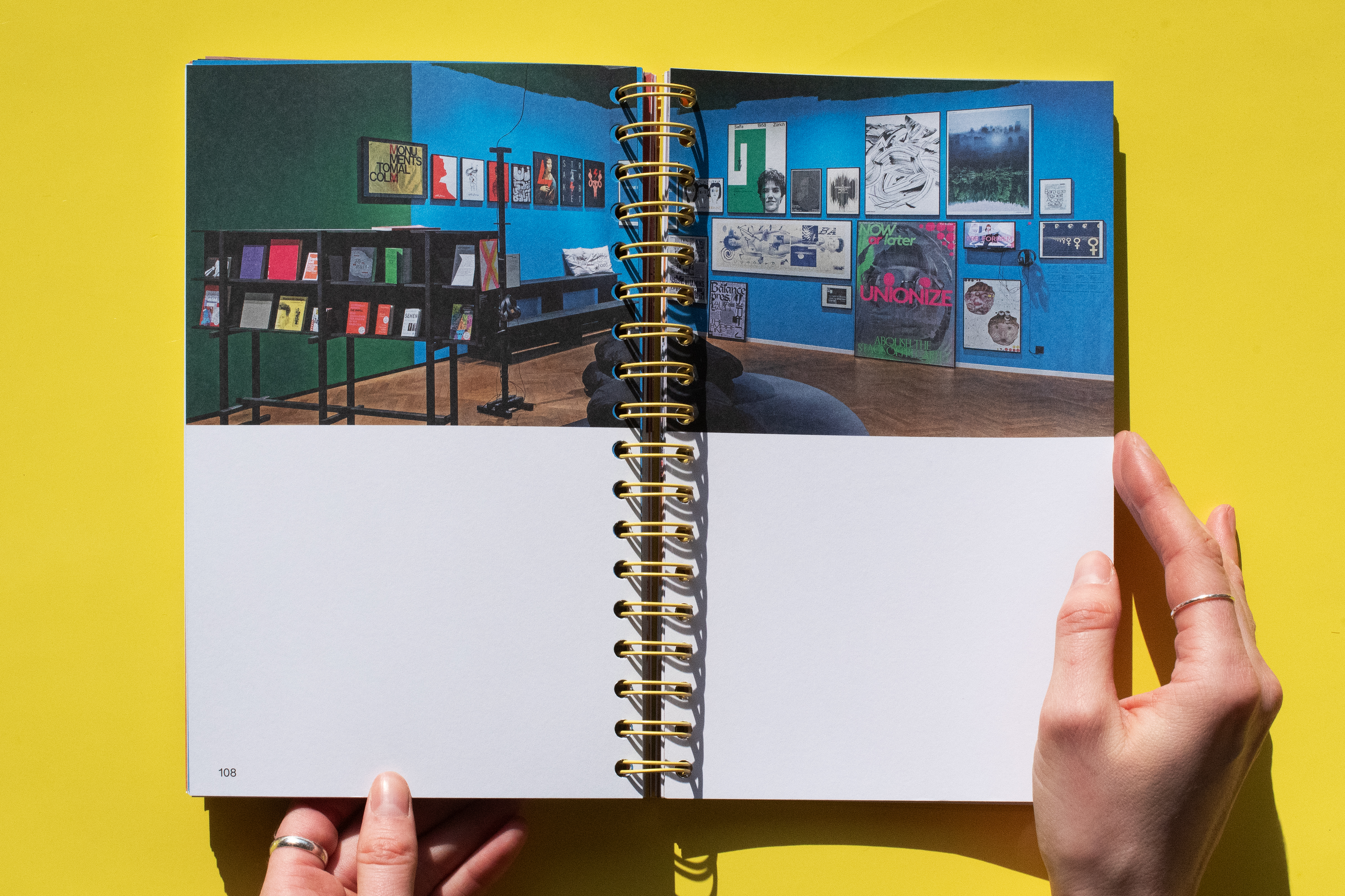
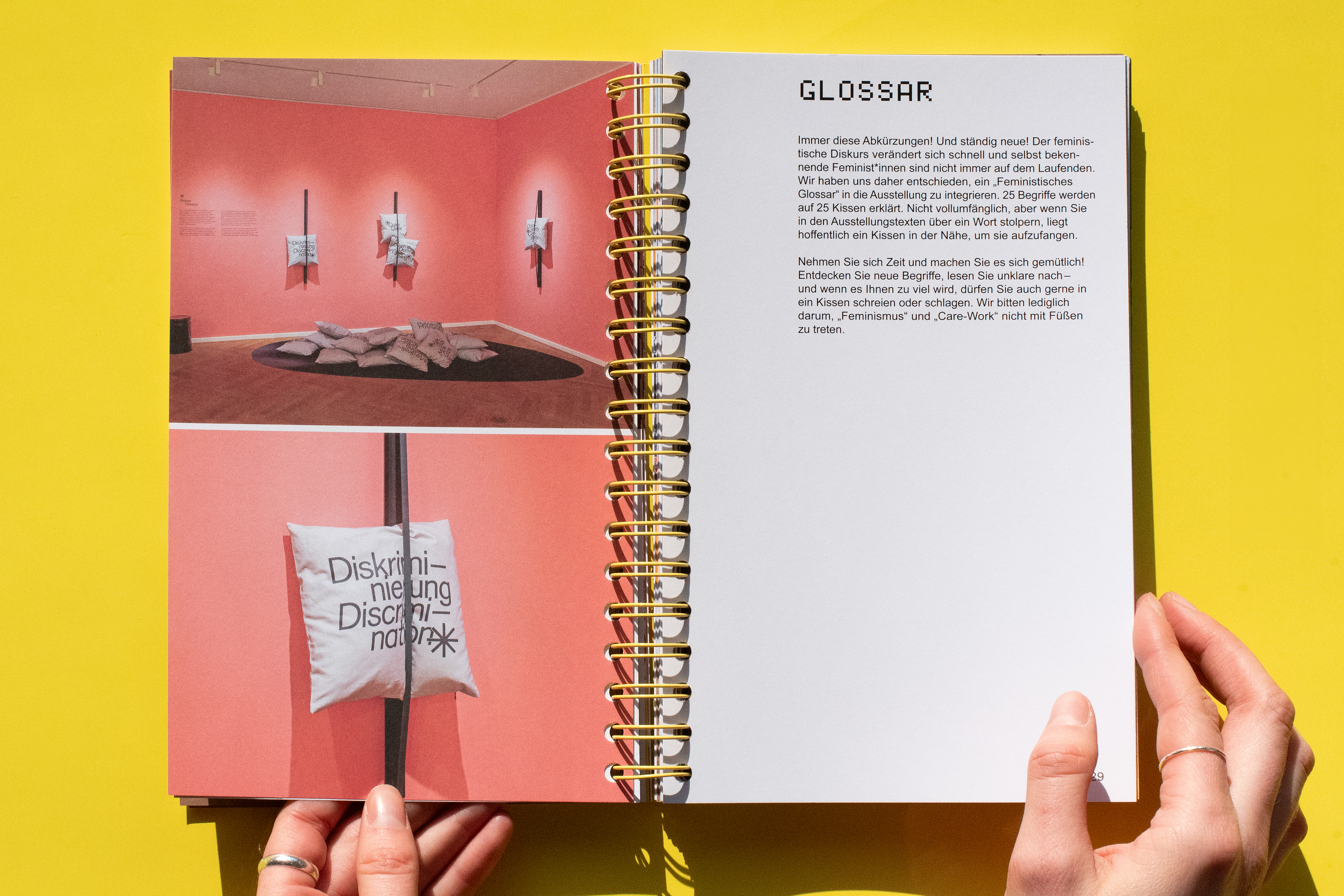
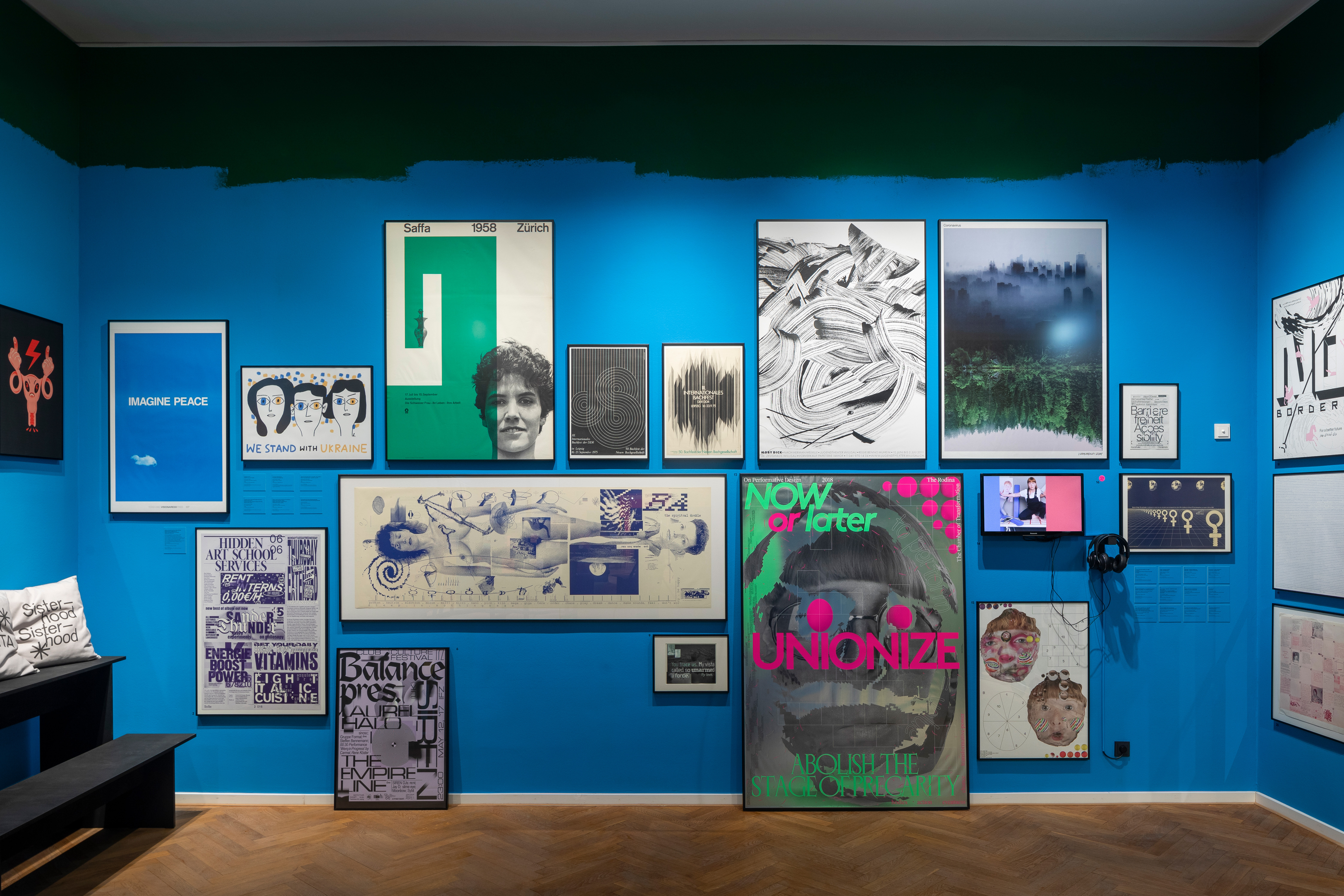
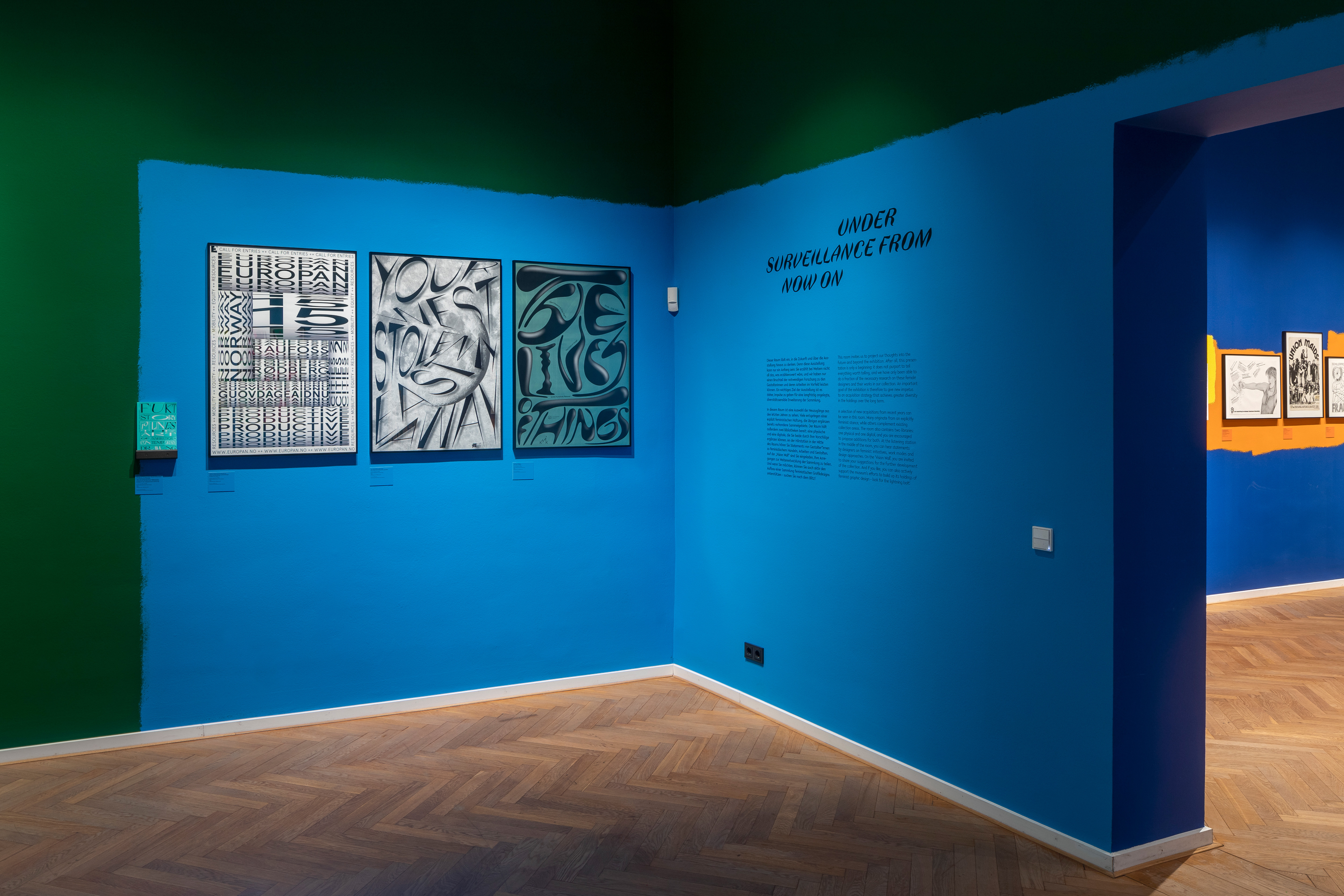
Outstanding historical works from the collection are shown in the third room. The presentation of contemporary feminist zines and a room offering an outlook on feminist graphic design complement the historical positions.
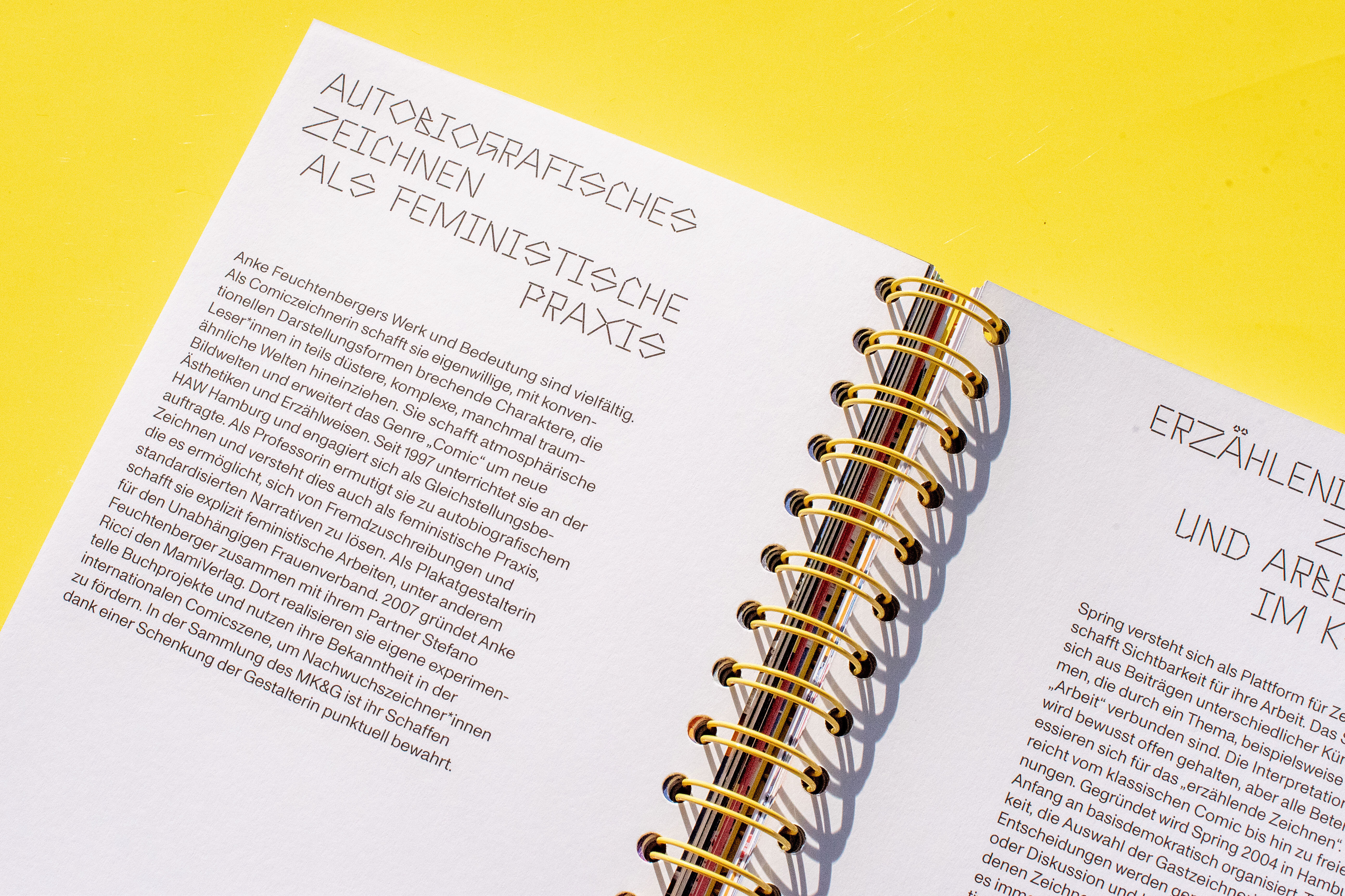
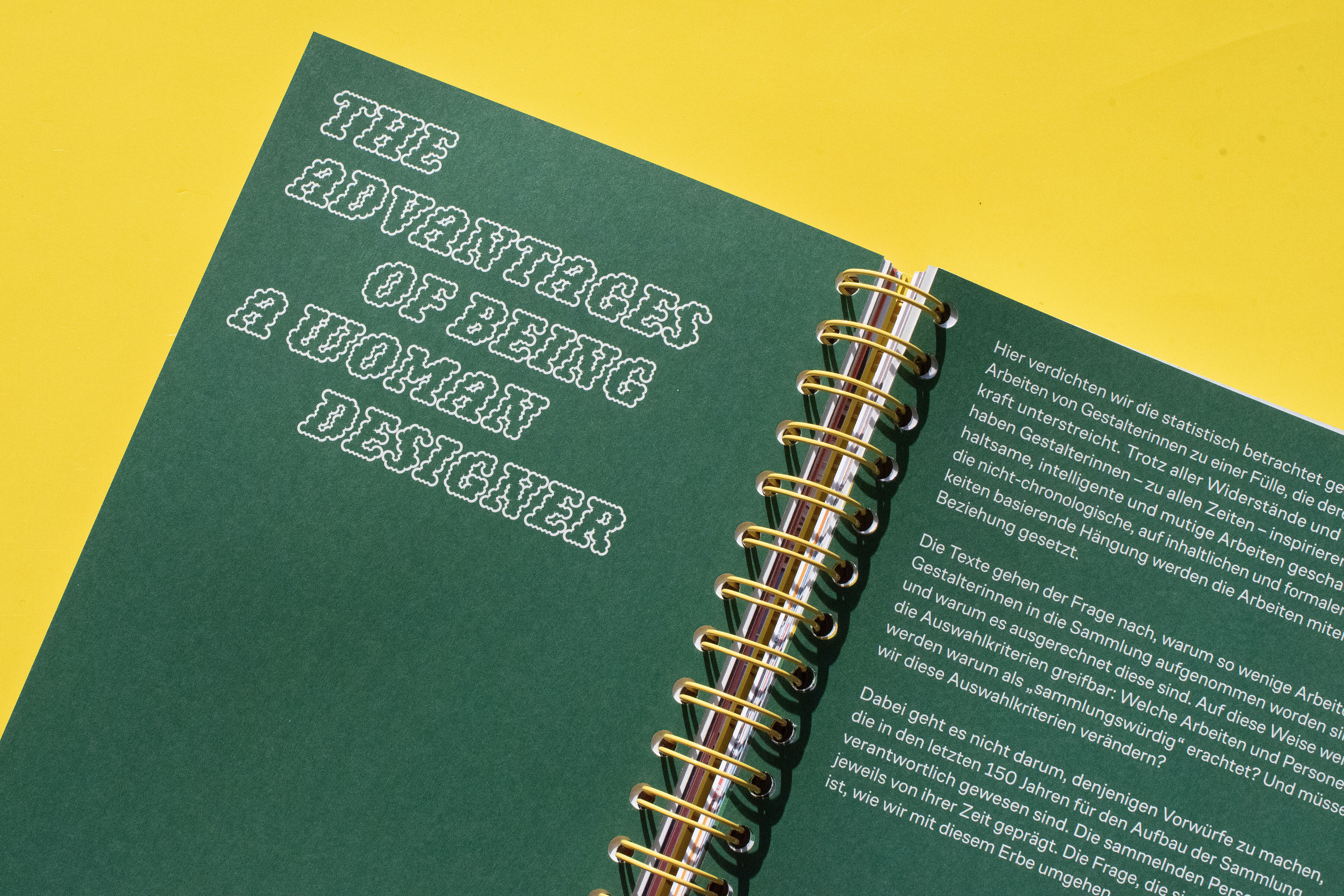
We have developed the graphics as an “typographic exhibition within the exhibition”. Fifteen different typefaces by female type designers such as Larissa Kasper, Patricia Saunders, Zuzana Ličko, Andrea Tinnes and Charlotte Rhode are used. This gives the rooms and themes a very different typographical appearance.
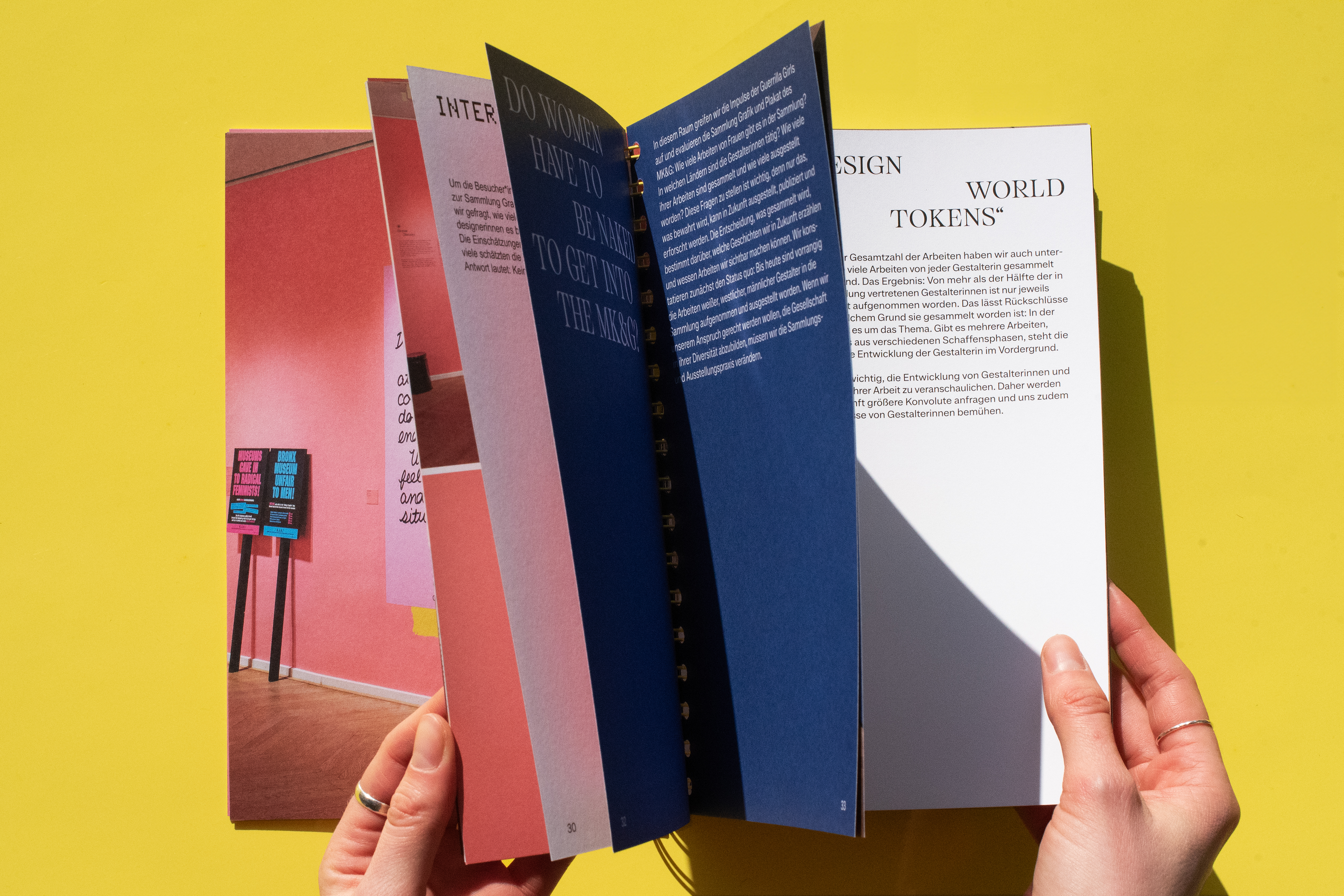
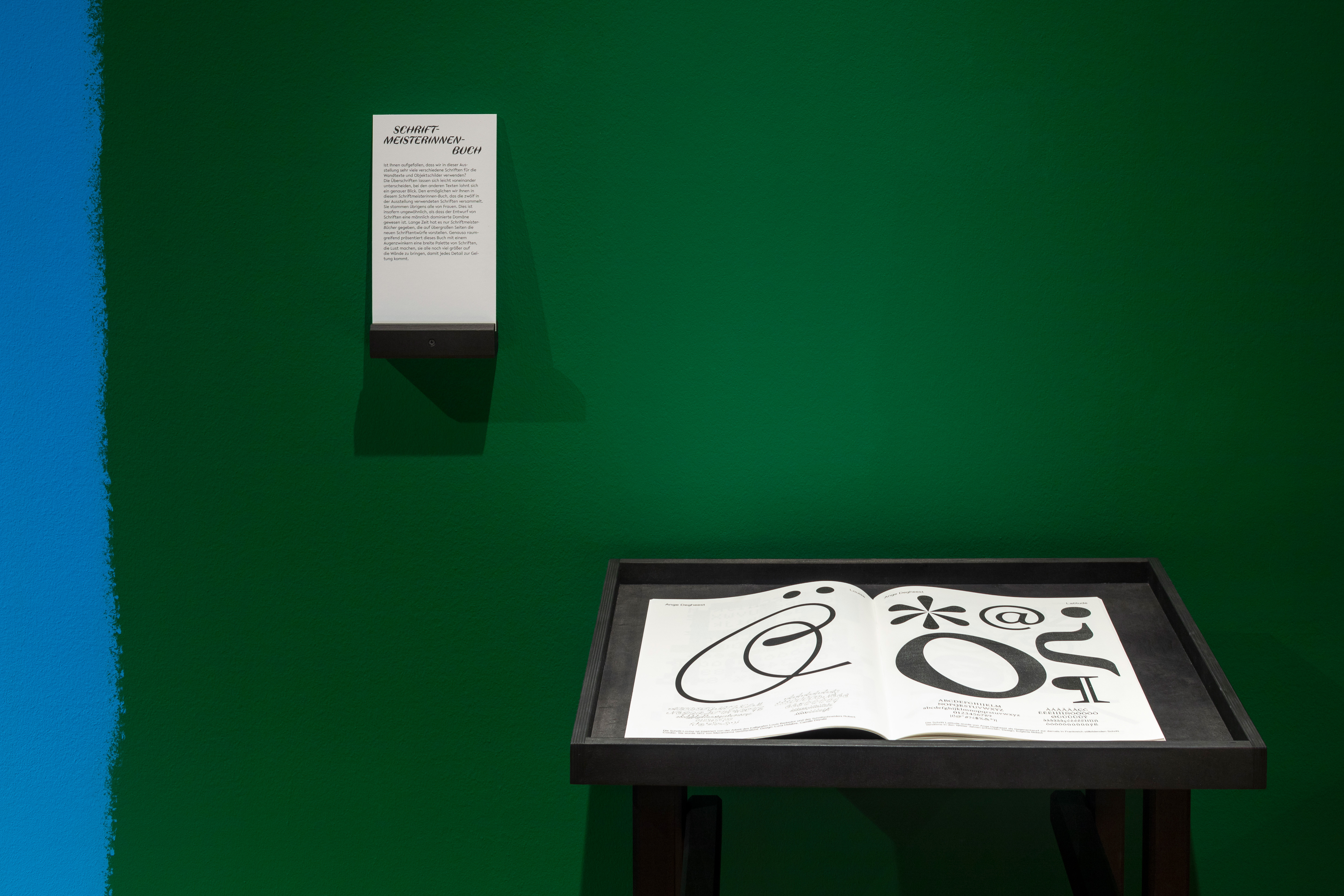
A “Schriftmeisterinnen” book introduces the designers and their typefaces.The publication was printed in an A2 format with a risograph. It was awarded by the Type Directors Club New York.
Exhibition design: ChmaraRosinke, mediation stations: Distaff Studio
Photos: Henning Rogge, Rimini Berlin
Identity
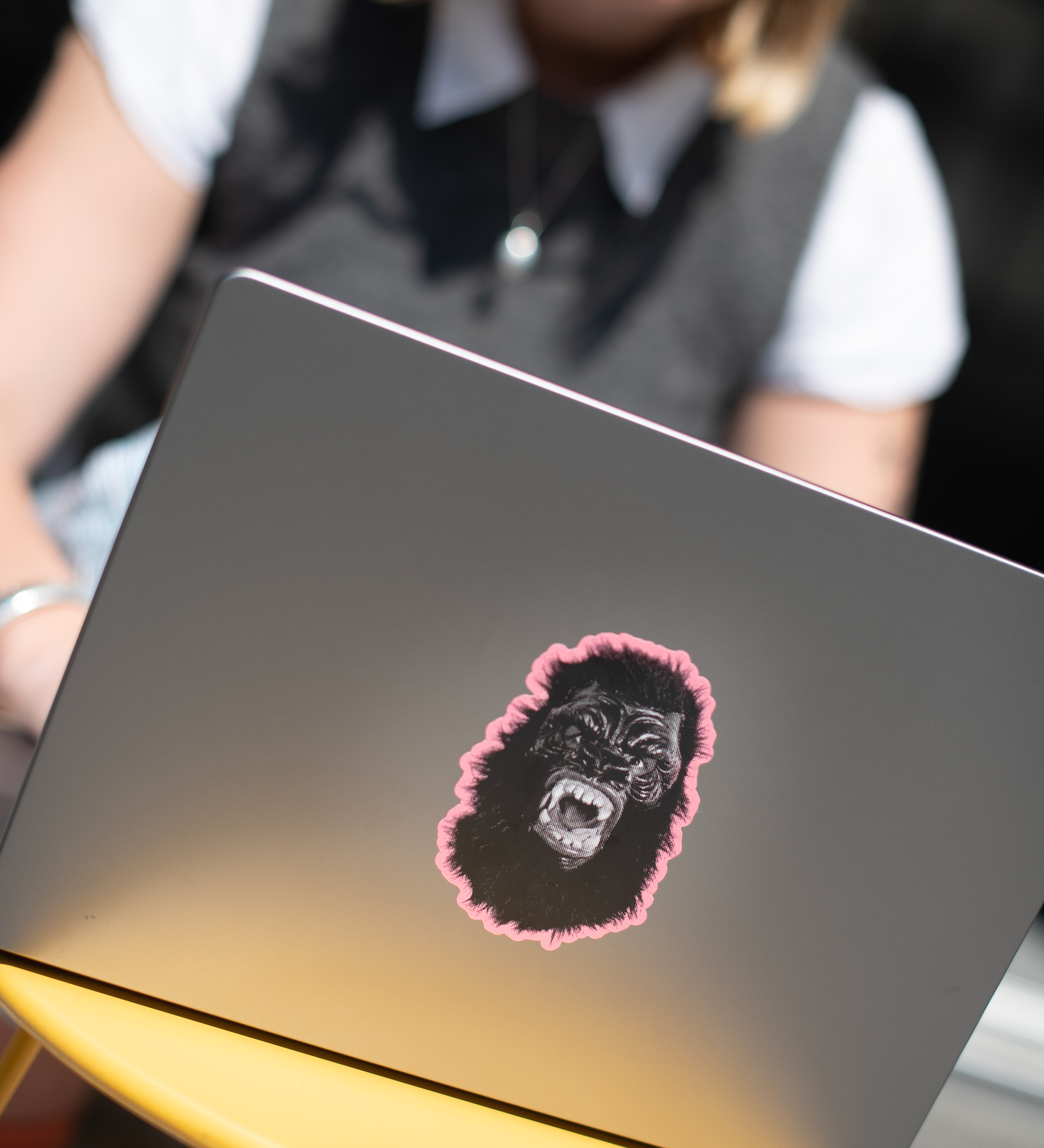
The campaign for “The F*Word – Guerrilla Girls and feminist graphic design” works with the iconic Guerrilla Girls gorilla and lets it roar into the urban space.
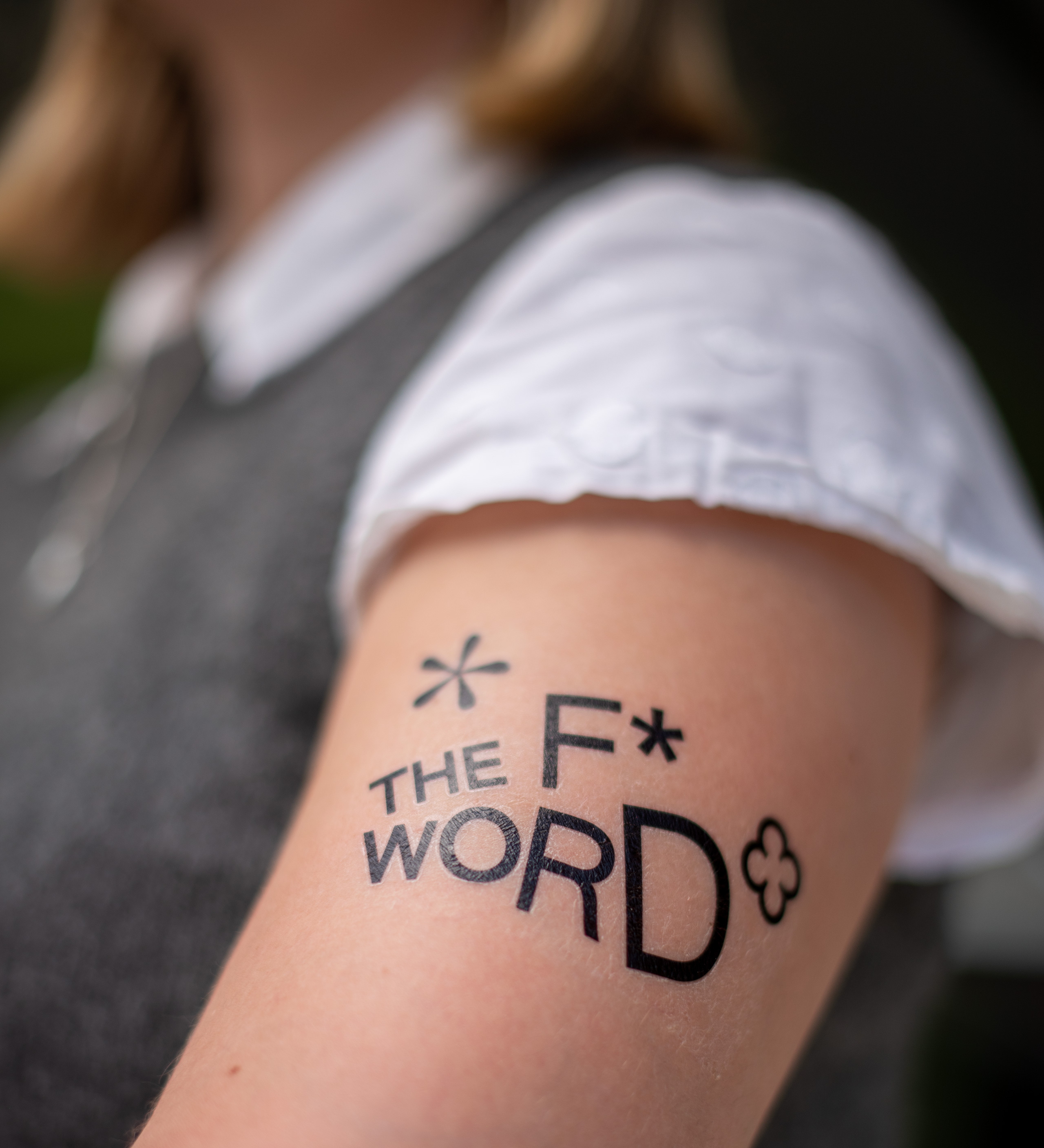
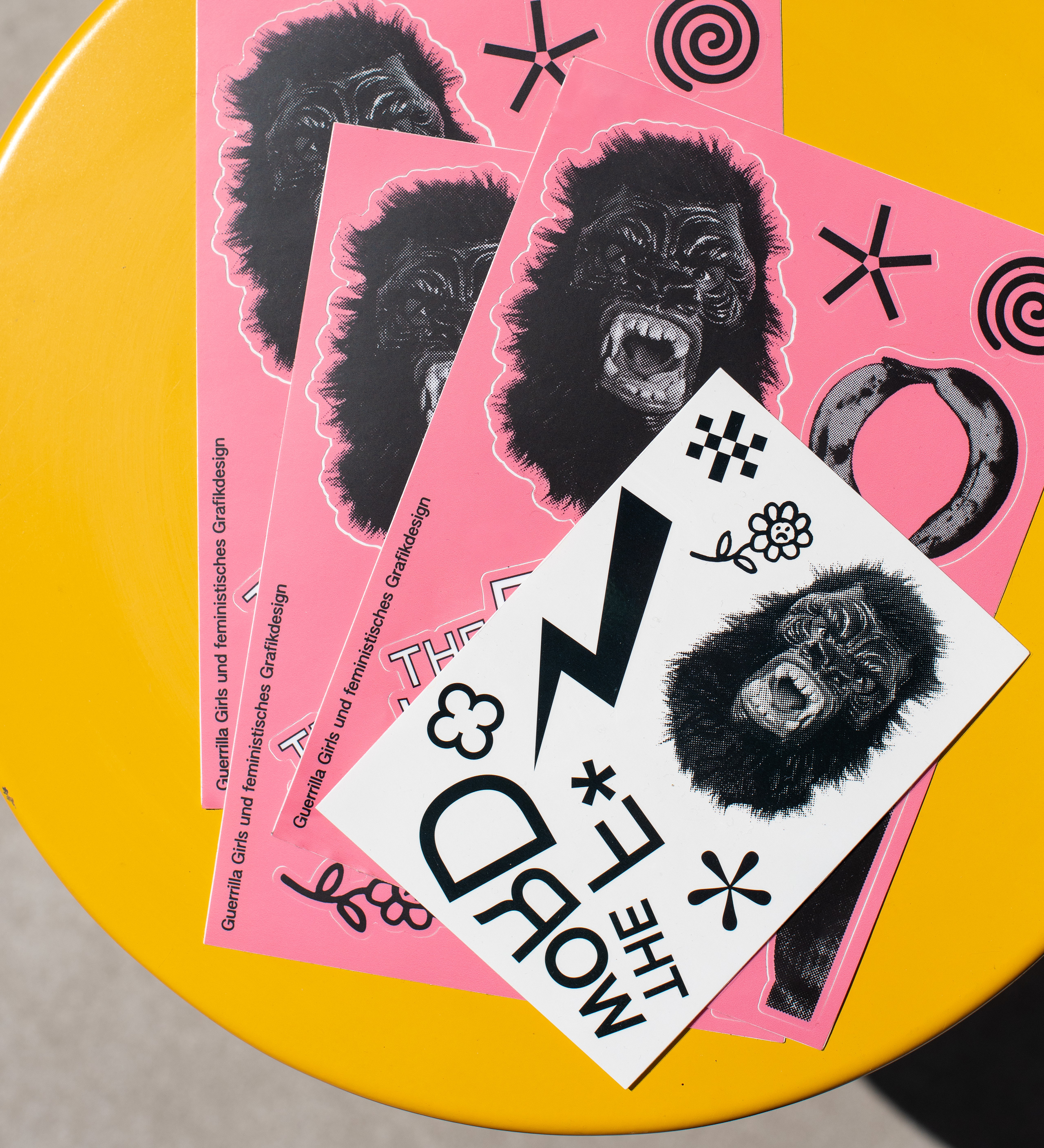
In addition to posters, digital formats, animations and ads, we also designed sticker sheets, postcards and temporary tattoos.
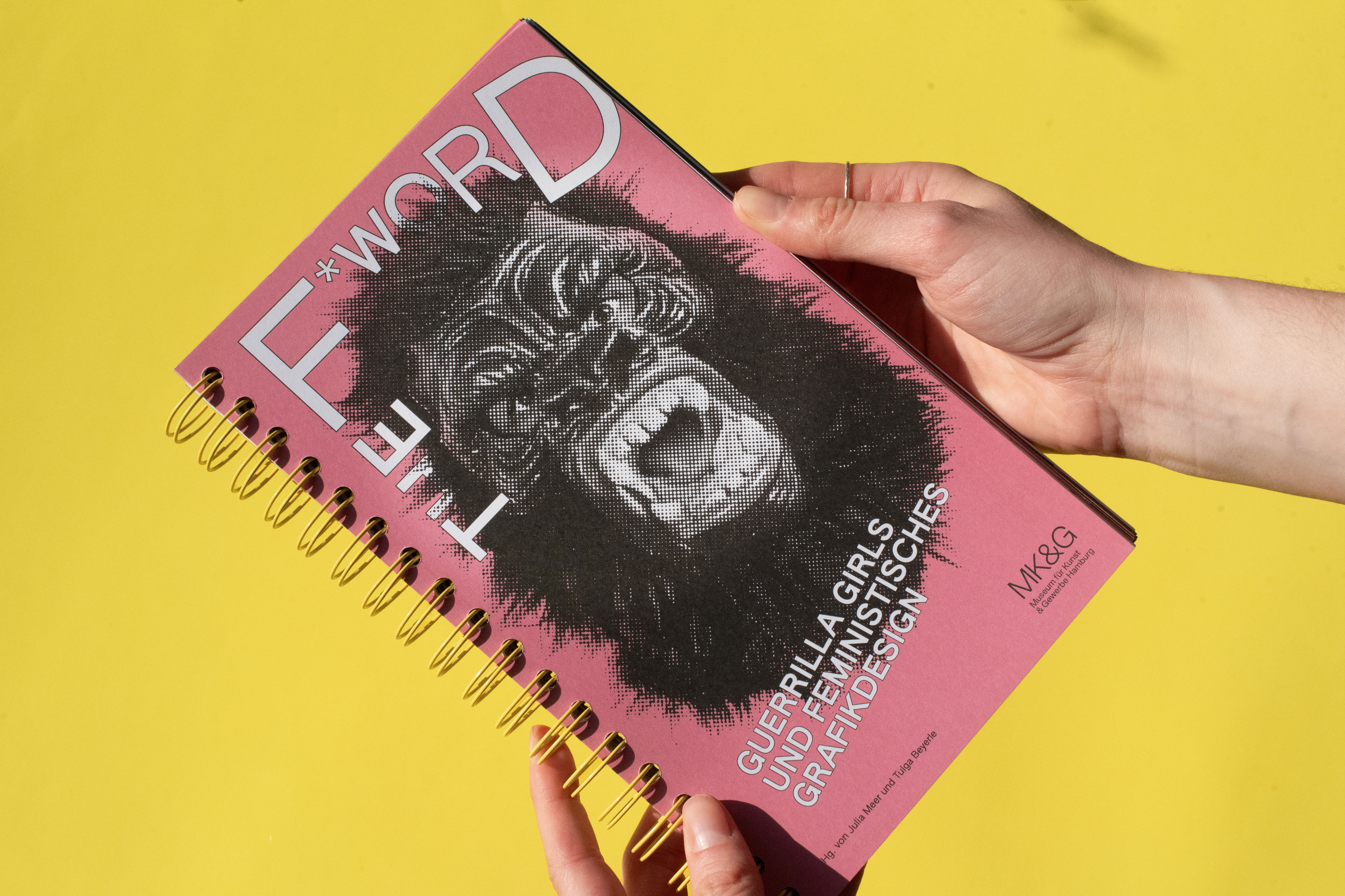
Publication
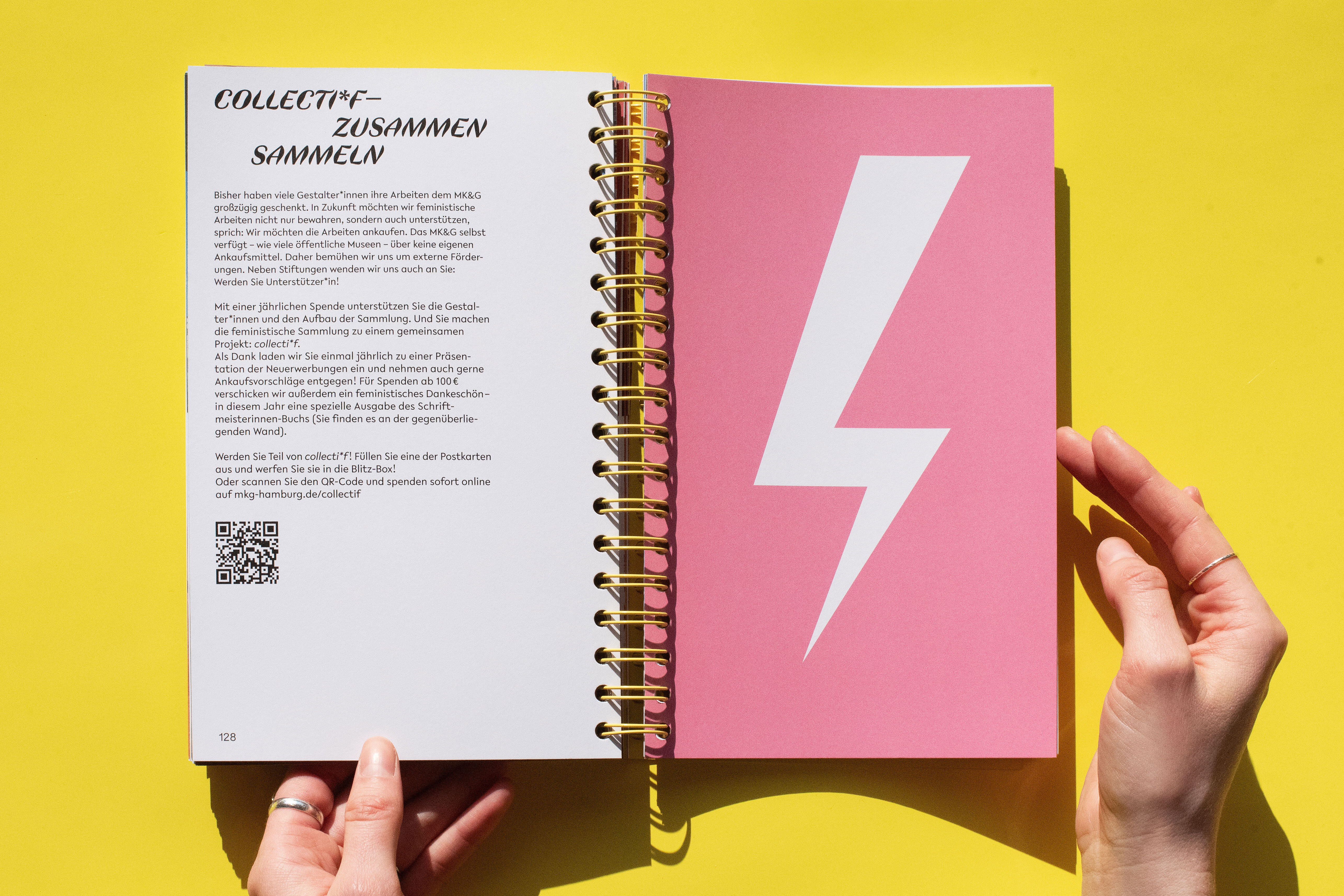
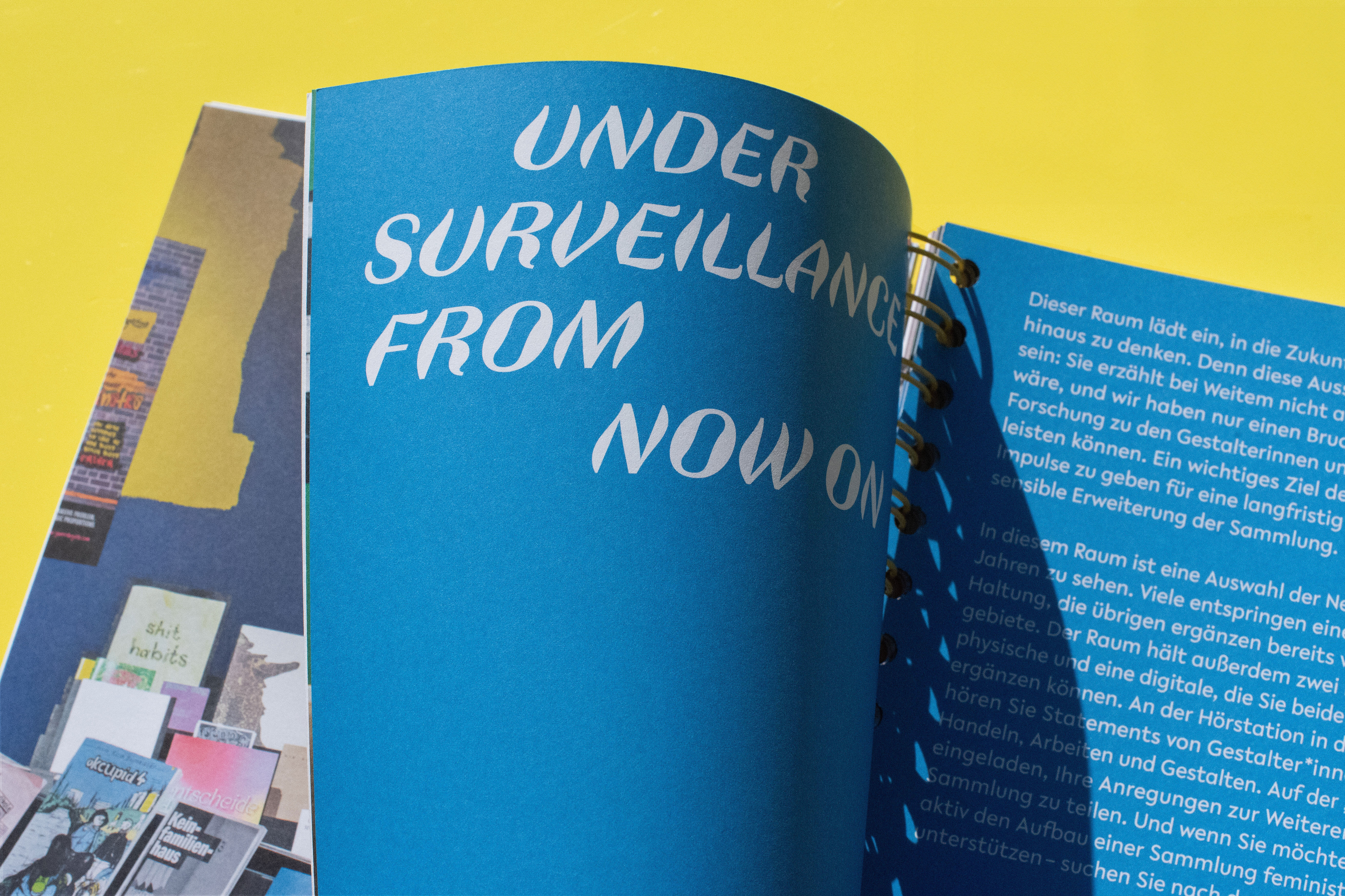
Following the exhibition, we designed a publication showing the exhibition texts and views of the exhibition. It retains the typographic concept of the exhibition: Each chapter is set with two typefaces by different type designers. The publication is bound with a yellow spiral to emphasize the processual nature of the exhibition and the research.
The publication was edited by Julia Meer, Head of the Graphic Arts Collection at the MK&G and Tulga Beyerle, Director of the Museum. In addition to the print version in a small edition, it is also available as a print-on-demand e-book at arthistoricum.net.